Home Buying
“What Are They Doing Upstairs?!” 5 Kinds of Bad Neighbors Sellers Won’t Warn You...

Real Estate News & Analysis
$768M Powerball Winner Could Buy Every Home for Sale in Madison, Milwaukee AND his...

Real Estate News & Analysis
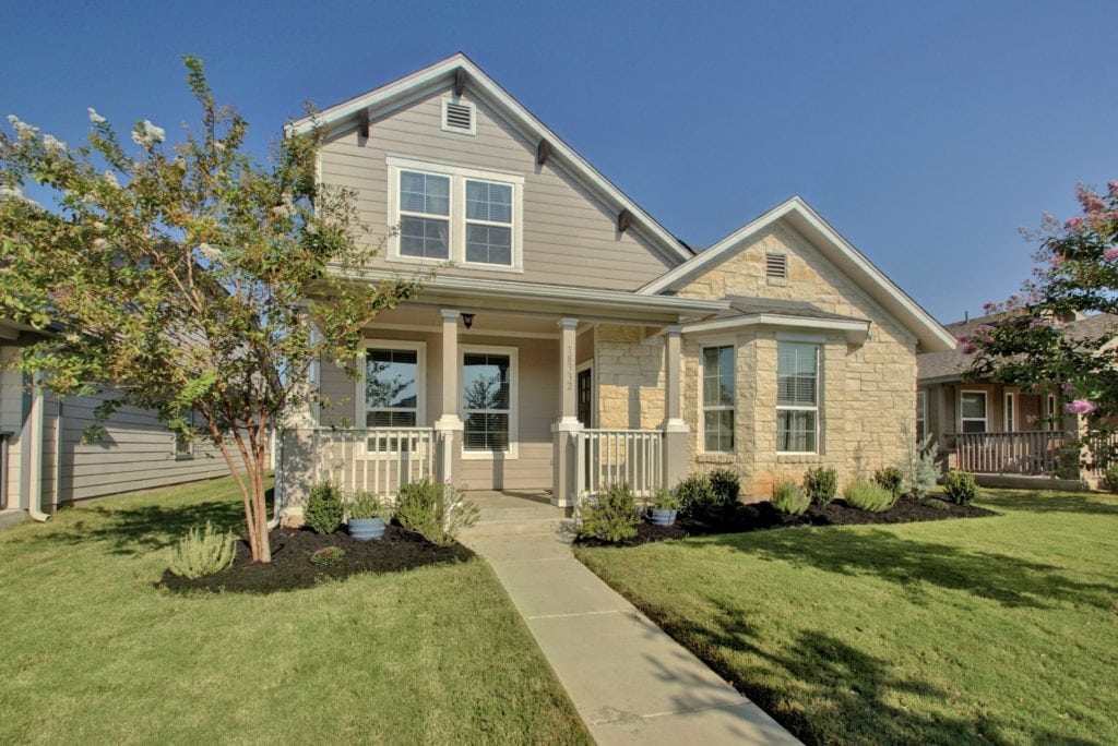
Do Homes With Open Houses Sell for More Money?

Special Reports
Minneapolis, Chicago and Philadelphia Are the Most Affordable Sustainable Cities
Housing Market News
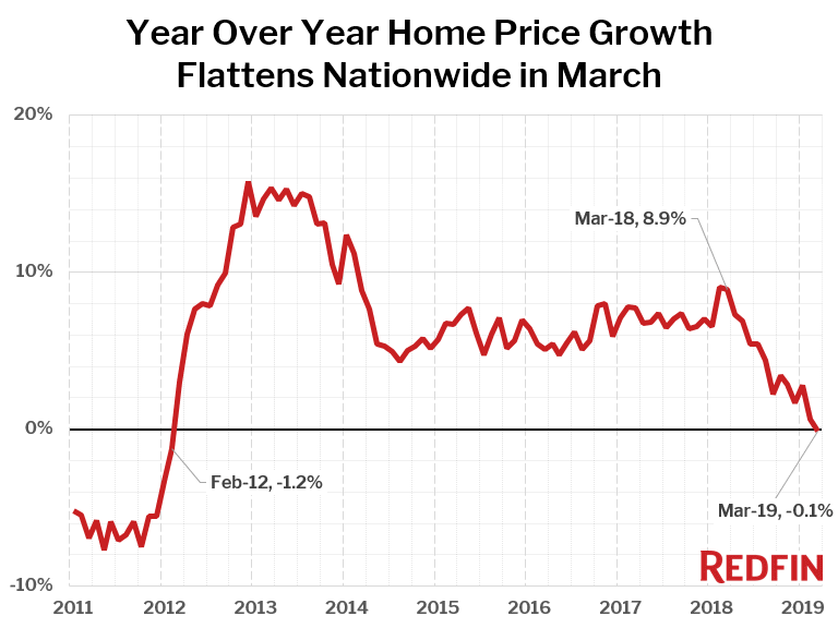
Home Sales Surge in Florida as California Markets See Double-Digit Annual Declines in...
Real Estate News & Analysis
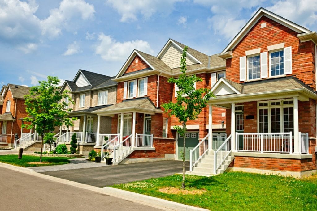
$768M Powerball Winner Could Buy Every Home for Sale in Madison, Milwaukee AND his Hometown of West Allis
Do Homes With Open Houses Sell for More Money?
Minneapolis, Chicago and Philadelphia Are the Most Affordable Sustainable Cities


Tips & Advice