<!DOCTYPE html><html lang="en" data-critters-container><head>
    <meta charset="utf-8">
    <title>Accessibility</title>
    <base href="/">
    <meta name="viewport" content="width=device-width, initial-scale=1">
    <link rel="icon" id="favicon-icon" type="image/x-icon" href="https://api.accessibility.com.au/company_info/5f9b4907761862f043c0da19c150e5d1.png">
    <link rel="stylesheet" href="https://pro.fontawesome.com/releases/v5.10.0/css/all.css">
    <link href="https://cdn.jsdelivr.net/npm/bootstrap@5.2.3/dist/css/bootstrap.min.css" rel="stylesheet">
    <link rel="stylesheet" href="https://cdn.jsdelivr.net/npm/swiper@11/swiper-bundle.min.css">
    <style>/* Font Tonnelier */
@font-face {
    font-family: "Tonnelier";
    font-weight: 100;
    font-display: swap;
    src: url("/assets/fonts/Tonnelier-Thin.woff2") format("woff2");
}
@font-face {
    font-family: "Tonnelier";
    font-weight: 300;
    font-display: swap;
    src: url("/assets/fonts/Tonnelier-Light.woff2") format("woff2");
}
@font-face {
    font-family: "Tonnelier";
    font-weight: 400;
    font-display: swap;
    src: url("/assets/fonts/Tonnelier-Regular.woff2") format("woff2");
}
@font-face {
    font-family: "Tonnelier";
    font-weight: 500;
    font-display: swap;
    src: url("/assets/fonts/Tonnelier-Medium.woff2") format("woff2");
}
@font-face {
    font-family: "Tonnelier";
    font-weight: 600;
    font-display: swap;
    src: url("/assets/fonts/Tonnelier-Semibold.woff2") format("woff2");
}

@font-face {
    font-family: "Tonnelier";
    font-weight: 700;
    font-display: swap;
    src: url("/assets/fonts/Tonnelier-Bold.woff2") format("woff2");
}
@font-face {
    font-family: "Tonnelier";
    font-weight: 900;
    font-display: swap;
    src: url("/assets/fonts/Tonnelier-Heavy.woff2") format("woff2");
}

* {
    padding: 0;
    margin: 0;
}

body{
    font-family: "Tonnelier", sans-serif !important;
    padding: 0 !important;
    margin: 0 !important;
}

:root{
    --main-color: #0083BF;
}

a{
    text-decoration: none;
}

ul {
    padding: 0;
    margin: 0;
}

ul li{
    list-style: none;
}

h1,h2,h3,p{
    padding: 0;
    margin: 0;
}

.pl-60{
    padding-left: 60px;
}

.pr-60{
    padding-right: 60px;
}

.pt-120{
    padding-top: 120px;
}

.pb-120{
    padding-bottom: 120px;
}

.img-contain{
    width: 100%;
    height: 100%;
    object-fit: contain;
}

.img-cover{
    width: 100%;
    height: 100%;
    object-fit: cover;
}

.main-btn{
    font-size: 16px;
    font-weight: 500;
    color: #fff;
    background-color: var(--main-color);
    padding: 8px 22px;
    text-decoration: none;
    border: none;
    display: block;
    width: fit-content;
    text-align: center;
}

.main-btn:hover{
    color: #fff;
}

/* header start */

header{
    background-color: #000;
}

header .navbar{
    padding: 25px 0;
}

header .navbar .navbar-brand{
    width: 198px;
    height: 58px;
}

header .navbar .navbar-nav{
    gap: 30px;
    margin-right: 40px;
}

header .navbar .navbar-nav .nav-link{
    font-size: 16px;
    color: #fff;
    font-weight: 400;
    padding: 5px 10px;
    position: relative;
}

header .navbar .navbar-nav .nav-link.active::after{
    content: '';
    display: block;
    width: 100%;
    border-bottom: 4px solid #fff;
    position: absolute;
    bottom: -37px;
    left: 0;
}

header .navbar .navbar-toggler{
    background-color: var(--main-color);
}

header .navbar .close-btn{
    display: none;
}

/* header end */

/* footer start */

footer .main-f .flex-box .right{
    min-width: 65%;
}

footer .main-f{
    background-color: #002D56;
    padding: 60px 0;
}

footer .main-f .flex-box{
    display: flex;
    justify-content: space-between;
    align-items: flex-start;
    gap: 30px;
}

footer .main-f .footer-logo{
    width: 198px;
    height: auto;
    display: block;
}

footer .main-f .box h3{
    color: #fff;
    font-size: 16px;
    font-weight: 500;
    text-transform: capitalize;
    margin-bottom: 15px;
}

footer .main-f .box ul {
    display: flex;
    align-items: center;
    gap: 15px;
}

footer .main-f .box ul li{
    width: 32px;
    height: 32px;
}

footer .main-f .box .link{
    color: #FFFFFF80;
    font-size: 16px;
    font-weight: 400;
    word-break: break-all;
}

footer .main-f .box .main-btn{
    max-width: 130px;
    width: 100%;
    margin-top: 20px;
}

footer .bottom-f{
    background-color: #042441;
    padding: 15px 0;
}

footer .bottom-f p{
    color: #FFFFFF;
    font-size: 14px;
    text-align: center;
}

/* footer end */

/* home hero banner start */

.hero-banner {
    width: 100%;
    min-height: 820px;
    background-position: center;
    background-repeat: no-repeat;
    background-size: 100% 100%;
    position: relative;
}
.hero-banner::before {
    content: '';
    background: #00000082;
    z-index: 1;
    position: absolute;
    top: 0;
    bottom: 0;
    left: 0;
    right: 0;
}

.hero-banner h1{
    font-size: 60px;
    font-weight: 700;
    line-height: 99px;
    text-transform: uppercase;
    color: #fff;
}

.hero-banner p{
    color: #fff;
    font-size: 16px;
    font-weight: 400;
    margin-bottom: 30px;
}

.hero-banner .white-btn{
    background-color: #fff;
    color: var(--main-color);
    font-size: 20px;
}

/* home hero banner end */

.sec-title{
    background: linear-gradient(98deg, #0083BF 14.02%, #002D56 100%);
    background-clip: text;
    -webkit-background-clip: text;
    -webkit-text-fill-color: transparent;
    font-size: 20px;
    font-weight: 600;
    text-transform: capitalize;
    text-align: center;
    width: fit-content;
    margin: auto;
    margin-bottom: 15px;
}

.sec-title::before{
    content: '';
    width: 100%;
    border-top: 1px solid #D1D1D1;
    display: block;
    margin-bottom: 5px;
}

.sec-sub-title{
    font-size: 35px;
    text-transform: uppercase;
    color: #000;
    line-height: 60px;
    font-weight: 400;
}

.sec .sec-sub-title{
    margin-bottom: 60px;
}

.describe{
    font-size: 16px;
    font-weight: 400;
    line-height: 30px;
    color: #000;
    /* text-transform: capitalize; */
}

/* home about us start */

.home-about .image-box{
    width: 100%;
    height: 100%;
}

.home-about .text-box{
    padding: 60px 40px;
    background-color: #F9F9F9;
    height: 100%;
}

.home-about .text-box p{
    font-size: 16px;
    color: #000;
    /* text-transform: capitalize; */
}

/* home about us end */

/* home experince start */

.home-experience {
    overflow: hidden;
}
/* home experince end */

/* home services start */

.home-service ul{
    display: flex;
    flex-wrap: wrap;
    justify-content: center;
}

.home-service ul li {
    width: 33%;
    padding: 60px 30px;
}

.home-service ul li:nth-child(1) {
    border: 1px solid #D4D4D4;
}
.home-service ul li:nth-child(2){
    border: 1px solid #D4D4D4;
    border-left: 0;
}
.home-service ul li:nth-child(3) {
    border: 1px solid #D4D4D4;
    border-left: 0;
}
.home-service ul li:nth-child(4){
    border: 1px solid #D4D4D4;
    border-top: 0;
}
.home-service ul li:nth-child(5) {
    border: 1px solid #D4D4D4;
    border-top: 0;
    border-left: 0;
}

.home-service ul li .image-box{
    width: 70px;
    height: 70px;
    margin: auto;
    margin-bottom: 30px;
}

.home-service ul li h3{
    font-size: 20px;
    color: #000;
    text-transform: capitalize;
    text-align: center;
} 

/* home services end */

/* Why accessibility start */

.sec-access{
    background-repeat: no-repeat;
    background-size: 100% 100%;
    /* min-height: 465px; */
    background-attachment: fixed;
}

.sec-access::after{
    content: '';
    background-color: #001324E3;
    position: absolute;
    top: 0;
    left: 0;
    width: 100%;
    height: 100%;
}

.sec-access .inner-box{
    z-index: 1;
    padding-top: 130px;
    padding-bottom: 130px;
}

.sec-access .sec-title{
    color: #fff;
    background: transparent;
    -webkit-text-fill-color: unset;
}

.sec-access .sec-title::before{
    border-top: 1px solid #00B4E5;
}

.sec-access .sec-sub-title{
    color: #fff;
    margin-bottom: 15px;
}

.sec-access h3{
    text-align: center;
    color: #fff;
    font-size: 16px;
    font-weight: 400;
    margin-bottom: 30px;
}

.sec-access .main-btn{
    margin: auto;
}

/* Why accessibility end */

/* industry start */

.sec-indus .sec-sub-title{
    margin-bottom: 10px;
}

.sec-indus .describe{
    font-size: 16px;
    font-weight: 400;
    line-height: 30px;
    color: #000;
    /* text-transform: capitalize; */
}

/* industry end */

/* our team page start */

/* our team page end */

/* blog page start */

/* .blog-detail-page .heighited-blog-box .img-box{
    height: auto;
} */

/* blog page end */

/* about page start */

.inner-hero-banner .inner-box2{
    padding: 160px 0 !important;
    position: relative;
    z-index: 2;
}

.inner-hero-banner {
    min-height: auto !important;
}

/* succes stories start */

/* succes stories end */

/* past project start */
/* .past-project-sec .grid-layout .box:nth-child(5){

} */

/* past project end */</style><link rel="stylesheet" href="./assets/css/common.css" media="print" onload="this.media='all'"><noscript><link rel="stylesheet" href="./assets/css/common.css"></noscript>
    <style>

@media only screen and (max-width: 1399px) {
    .pb-120 {
        padding-bottom: 100px;
    }
    .pt-120 {
        padding-top: 100px;
    }
    .sec-sub-title {
        font-size: 26px;
        line-height: 46px;
    }
    .sec .sec-sub-title {
        margin-bottom: 45px;
    }
    header .navbar .navbar-brand {
        width: 170px;
    }
    header .navbar .navbar-nav {
        gap: 20px;
    }
    .hero-banner {
        min-height: 670px;
    }
    .hero-banner h1 {
        font-size: 50px;
        line-height: 80px;
    }
    .home-about .text-box {
        padding: 40px;
    }
    .home-service ul li {
        padding: 50px 30px;
    }
    .home-service ul li .image-box {
        width: 50px;
        height: 50px;
    }
    .home-service ul li h3 {
        font-size: 18px;
    }
    .sec-access .inner-box {
        padding-top: 100px;
        padding-bottom: 100px;
    }
    footer .main-f .footer-logo {
        width: 170px;
    }

    /* our-team */

    /* blog page */

    /* about */

    /* success stories */
    footer .main-f .flex-box .right {
        min-width: 75%;
    }
}

@media only screen and (max-width: 1199px) {
    .pr-60 {
        padding-right: 40px;
    }
    .pl-60 {
        padding-left: 40px;
    }
    .pb-120 {
        padding-bottom: 80px;
    }
    .pt-120 {
        padding-top: 80px;
    }
    header .navbar {
        padding: 20px 0;
    }
    header .navbar .navbar-nav {
        gap: 10px;
        margin-right: 25px;
    }
    header .navbar .navbar-nav .nav-link {
        padding: 5px;
    }
    header .navbar .navbar-nav .nav-link.active::after {
        bottom: -29px;
    }
    .sec-title {
        font-size: 18px;
    }
    .sec-sub-title {
        font-size: 22px;
        line-height: 40px;
    }
    .sec .sec-sub-title {
        margin-bottom: 40px;
    }
    .hero-banner h1 {
        font-size: 42px;
        line-height: 70px;
    }
    .hero-banner .white-btn {
        font-size: 18px;
    }

    /* blog page */

    /* success stories */
}

@media only screen and (max-width: 991px) {
    .pt-120 {
        padding-top: 60px;
    }
    .pb-120 {
        padding-bottom: 60px;
    }
    .pl-60 {
        padding-left: 30px;
    }
    .pr-60 {
        padding-right: 30px;
    }
    .sec-sub-title {
        font-size: 18px;
        line-height: 30px;
    }
    .describe{
        font-size: 14px;
        line-height: 26px;
    }
    header .navbar .navbar-collapse {
        position: fixed;
        top: 0;
        right: 0;
        min-height: 100vh;
        width: 300px;
        transform: translate(600px, 0);
        background-color: #000;
        padding: 0 20px 20px;
        z-index: 111;
        box-shadow: -6px 1px 5px 0 rgb(0 0 0 / 48%);
        transition: 0.5s all;
        overflow: auto;
        height: 50vh;
    }
    header .navbar .navbar-nav {
        margin: 0;
    }
    header .navbar .navbar-nav .nav-link.active {
        padding-left: 13px;
    }
    header .navbar .navbar-nav .nav-link.active::after {
        bottom: 17px;
        border-width: 2px;
        width: 5px;
    }
    header .navbar .main-btn {
        margin-top: 15px;
    }
    header .navbar .close-btn {
        display: block;
        padding: 10px 0;
        position: sticky;
        top: 0px;
        background-color: #000;
        z-index: 1;
    }
    header .navbar .close-btn i {
        font-size: 22px;
        color: #fff;
        padding: 10px;
        font-weight: 300;
    }
    footer .main-f {
        padding: 40px 0;
    }
    footer .main-f .flex-box {
        flex-direction: column;
    }
    footer .main-f .flex-box .right{
        min-width: 100%;
    }
    .hero-banner {
        background-position: right;
        background-size: cover;
        min-height: 550px;
    }
    .hero-banner h1 {
        font-size: 36px;
        line-height: 60px;
    }
    .home-about .image-box {
        max-height: 300px;
    }
    .home-service ul li {
        padding: 40px 30px;
    }
    .sec-access .inner-box {
        padding-top: 100px;
        padding-bottom: 100px;
    }
    /* our-team */

    /* blog page */

    /* about us */
}

@media only screen and (max-width: 767px) {
    .home-service ul li {
        padding: 30px 20px;
    }
    .home-service ul li h3 {
        font-size: 16px;
    }
    /* our-team */

    /* blog page */

    /* about */
}

@media only screen and (max-width: 575px) {
    .pt-120 {
        padding-top: 50px;
    }
    .pb-120 {
        padding-bottom: 50px;
    }
    .pr-60 {
        padding-right: 20px;
    }
    .pl-60 {
        padding-left: 20px;
    }
    .sec .sec-sub-title {
        margin-bottom: 30px;
    }
    header .navbar .navbar-collapse {
        width: 100%;
        overflow: auto;
        height: 50vh;
    }
    .hero-banner {
        min-height: 420px;
    }
    .hero-banner h1 {
        font-size: 32px;
        line-height: 50px;
    }
    .hero-banner .white-btn {
        font-size: 16px;
    }
    .home-about .text-box {
        padding: 30px 20px;
    }
    .home-service ul li {
        width: 100%;
        border: 1px solid #d4d4d4 !important;
        border-top: none !important;
    }
    .home-service ul li:nth-child(1) {
        border-top: 1px solid #d4d4d4 !important;
    }
    .sec-access .inner-box {
        padding-top: 60px;
        padding-bottom: 60px;
    }
    /* our-team */
    
    /* blog page */
    /* about us */
    .main-btn{
        font-size: 14px;
    }
}</style><link rel="stylesheet" href="./assets/css/media.css" media="print" onload="this.media='all'"><noscript><link rel="stylesheet" href="./assets/css/media.css"></noscript>
    <meta name="description" content>
    <meta name="keywords" content>
  <link rel="stylesheet" href="styles-5INURTSO.css"><link rel="modulepreload" href="chunk-IXHGKX55.js"><link rel="modulepreload" href="chunk-WMFAHUYB.js"></head>
  <body><!--nghm-->
    <app-root _nghost-ng-c852840971 ng-version="17.0.8" ngh="3" ng-server-context="ssr"><router-outlet _ngcontent-ng-c852840971></router-outlet><app-home _nghost-ng-c3775874844 ngh="2"><app-header _ngcontent-ng-c3775874844 _nghost-ng-c4088846189 ngh="0"><header _ngcontent-ng-c4088846189><nav _ngcontent-ng-c4088846189 class="navbar navbar-expand-lg"><div _ngcontent-ng-c4088846189 class="container-fluid pl-60 pr-60"><a _ngcontent-ng-c4088846189 routerlink="/" class="navbar-brand" href="/"><img _ngcontent-ng-c4088846189 onerror="this.src = 'assets/images/logo.png'" alt="logo" width="200" height="50" class="img-contain" src="https://api.accessibility.com.au/company_info/971b167b36fec765528cdff1422ed9e3.png"></a><button _ngcontent-ng-c4088846189 type="button" data-bs-toggle="collapse" data-bs-target="#navbarSupportedContent" aria-controls="navbarSupportedContent" aria-expanded="false" aria-label="Toggle navigation" class="navbar-toggler"><i _ngcontent-ng-c4088846189 class="far fa-bars text-white"></i></button><div _ngcontent-ng-c4088846189 id="navbarSupportedContent" class="collapse navbar-collapse justify-content-end"><div _ngcontent-ng-c4088846189 class="close-btn text-end"><i _ngcontent-ng-c4088846189 type="button" data-bs-toggle="collapse" data-bs-target="#navbarSupportedContent" aria-controls="navbarSupportedContent" aria-expanded="false" aria-label="Toggle navigation" class="far fa-times"></i></div><ul _ngcontent-ng-c4088846189 class="navbar-nav"><li _ngcontent-ng-c4088846189 class="nav-item"><a _ngcontent-ng-c4088846189 routerlink="/" routerlinkactive="active" class="nav-link active" href="/">Home</a></li><!----><li _ngcontent-ng-c4088846189 class="nav-item"><a _ngcontent-ng-c4088846189 routerlinkactive="active" class="nav-link" href="/about-us">About Us</a></li><!----><li _ngcontent-ng-c4088846189 class="nav-item"><a _ngcontent-ng-c4088846189 routerlinkactive="active" class="nav-link" href="/our-team">Our Board</a></li><!----><!----><!----><li _ngcontent-ng-c4088846189 class="nav-item"><a _ngcontent-ng-c4088846189 routerlinkactive="active" class="nav-link" href="/blogs">News/Blogs</a></li><!----></ul><a _ngcontent-ng-c4088846189 class="main-btn fdf" href="/contact-us">Apply Now</a><!----></div></div></nav></header></app-header><section _ngcontent-ng-c3775874844 class="hero-banner inner-hero-banner" style="background-image: url(https://api.accessibility.com.au/banner/1715064801998.jpeg);"><div _ngcontent-ng-c3775874844 class="container-fluid pl-60 pr-60"><div _ngcontent-ng-c3775874844 class="inner-box2"><h1 _ngcontent-ng-c3775874844>Welcome to accessibility</h1><!----><!----><div _ngcontent-ng-c3775874844><p>Next generation SDA architecture and sustainable materials delivering better housing outcomes for NDIS participants</p></div><!----><a _ngcontent-ng-c3775874844 target="_blank" class="main-btn white-btn" href="/contact-us"> Contact us </a></div></div></section><!----><section _ngcontent-ng-c3775874844 class="home-about pt-120 sec"><div _ngcontent-ng-c3775874844 class="pl-60 pr-60"><h2 _ngcontent-ng-c3775874844 class="sec-title">About us</h2><!----><p _ngcontent-ng-c3775874844 class="sec-sub-title text-center">A+ specializes in the development, construction, participant engagement and operation of Specialist Disability Accommodation (SDA).</p><!----><div _ngcontent-ng-c3775874844 class="row g-0"><div _ngcontent-ng-c3775874844 class="col-lg-6"><div _ngcontent-ng-c3775874844 class="image-box"><img _ngcontent-ng-c3775874844 ngoptimizedimage onerror="this.src = 'assets/images/Rectangle 67.png'" width="800" height="600" loading="lazy" class="img-cover" src="https://api.accessibility.com.au/section/1709450941278.jpeg" alt="About us image"></div></div><div _ngcontent-ng-c3775874844 class="col-lg-6"><div _ngcontent-ng-c3775874844 class="text-box"><p>
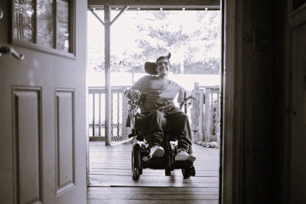
We take a participant led focus to provide what participants are looking for in a home, maximize engagement and reduce tenancy risk. We will create feasible projects based on participant need in locations that are identified as preferable. We will create feasible projects at the outset and reduce risk, and unnecessary costs.</p><p><br></p><p>​We have combined expertise with project management, architecture and construction expertise and occupational therapy input into all aspects of environmental design, social models, support models and individual function.</p><p><br></p><p>Our focus is to go beyond the standards to apply best practice guidelines to enable superior outcomes for all involved.</p><p><br></p><p>Our process is what sets us apart. We engage with participants in decision making regarding the design of their home. Due to our engagement with occupational therapists, our participant tenants will have a have a smoother transition into their new homes.</p></div></div></div></div></section><!----><section _ngcontent-ng-c3775874844 class="home-experience pt-120 sec"><!----></section><section _ngcontent-ng-c3775874844 class="home-service pt-120 pb-120 sec"><div _ngcontent-ng-c3775874844 class="pl-60 pr-60"><h2 _ngcontent-ng-c3775874844 class="sec-title">Our services</h2><!----><p _ngcontent-ng-c3775874844 class="sec-sub-title text-center">We provide expertise services in experienced SDA architecture, occupational therapy &amp; construction management</p><!----><ul _ngcontent-ng-c3775874844><li _ngcontent-ng-c3775874844><div _ngcontent-ng-c3775874844 class="image-box"><img _ngcontent-ng-c3775874844 ngoptimizedimage width="75" height="75" loading="lazy" onerror="this.src = 'assets/images/Frame (3).png'" class="img-contain" src="https://api.accessibility.com.au/service/1708585076483.png" alt="Site Feasibility and Procurement image"></div><h3 _ngcontent-ng-c3775874844>Site Feasibility and Procurement</h3></li><li _ngcontent-ng-c3775874844><div _ngcontent-ng-c3775874844 class="image-box"><img _ngcontent-ng-c3775874844 ngoptimizedimage width="75" height="75" loading="lazy" onerror="this.src = 'assets/images/Frame (3).png'" class="img-contain" src="https://api.accessibility.com.au/service/1708585100192.png" alt="Planning and Participant Led Design image"></div><h3 _ngcontent-ng-c3775874844>Planning and Participant Led Design</h3></li><li _ngcontent-ng-c3775874844><div _ngcontent-ng-c3775874844 class="image-box"><img _ngcontent-ng-c3775874844 ngoptimizedimage width="75" height="75" loading="lazy" onerror="this.src = 'assets/images/Frame (3).png'" class="img-contain" src="https://api.accessibility.com.au/service/1708585122172.png" alt="Project Management &amp; Construction Delivery image"></div><h3 _ngcontent-ng-c3775874844>Project Management &amp; Construction Delivery</h3></li><li _ngcontent-ng-c3775874844><div _ngcontent-ng-c3775874844 class="image-box"><img _ngcontent-ng-c3775874844 ngoptimizedimage width="75" height="75" loading="lazy" onerror="this.src = 'assets/images/Frame (3).png'" class="img-contain" src="https://api.accessibility.com.au/service/1708585141830.png" alt="NDIS Participant Engagement image"></div><h3 _ngcontent-ng-c3775874844>NDIS Participant Engagement</h3></li><li _ngcontent-ng-c3775874844><div _ngcontent-ng-c3775874844 class="image-box"><img _ngcontent-ng-c3775874844 ngoptimizedimage width="75" height="75" loading="lazy" onerror="this.src = 'assets/images/Frame (3).png'" class="img-contain" src="https://api.accessibility.com.au/service/1708585173628.png" alt="SDA Housing Management image"></div><h3 _ngcontent-ng-c3775874844>SDA Housing Management</h3></li><!----></ul><!----></div></section><!----><section _ngcontent-ng-c3775874844 class="sec-access position-relative" style="background-image: url(https://api.accessibility.com.au/section/1708585278030.png),url('assets/images/Rectangle 80.png');"><div _ngcontent-ng-c3775874844 class="pl-60 pr-60 position-relative inner-box pl-60 pr-60"><h2 _ngcontent-ng-c3775874844 class="sec-title">Why A+</h2><!----><!----><p _ngcontent-ng-c3775874844 class="sec-sub-title text-center">A different approach - innovative architecture and a new method of housing construction.</p><!----><!----><h3 _ngcontent-ng-c3775874844><p>We concentrate on using innovative architecture and natural building materials and a new method of housing construction that can means our product can be built in less than a third of the time of a conventional house.</p></h3><a _ngcontent-ng-c3775874844 target="_blank" class="main-btn" href="/contact-us">Contact us</a></div></section><!----><section _ngcontent-ng-c3775874844 class="sec-indus pt-120 pb-120"><div _ngcontent-ng-c3775874844 class="pl-60 pr-60"><div _ngcontent-ng-c3775874844 class="row g-4"><div _ngcontent-ng-c3775874844 class="col-12 text-center"><h2 _ngcontent-ng-c3775874844 class="sec-title">Industry</h2><!----><p _ngcontent-ng-c3775874844 class="sec-sub-title">Our Partners</p><!----><div _ngcontent-ng-c3775874844 class="describe"><p>Our Partners share the journey with us.  They understand that delivery of accessibility outcomes are based on an understanding of the symbiotic relationship between people with mobility needs and the built environment.</p></div><!----></div><!----><!----></div></div></section><!----><app-footer _ngcontent-ng-c3775874844 _nghost-ng-c928858216 ngh="1"><footer _ngcontent-ng-c928858216><div _ngcontent-ng-c928858216 class="main-f"><div _ngcontent-ng-c928858216 class="container-fluid pl-60 pr-60"><div _ngcontent-ng-c928858216 class="flex-box"><div _ngcontent-ng-c928858216 class="left"><a _ngcontent-ng-c928858216 routerlink="/" class="footer-logo" href="/"><img _ngcontent-ng-c928858216 onerror="this.src = 'assets/images/logo.png'" alt="logo" width="200" height="50" loading="lazy" class="img-contain" src="https://api.accessibility.com.au/company_info/971b167b36fec765528cdff1422ed9e3.png"></a></div><div _ngcontent-ng-c928858216 class="right"><div _ngcontent-ng-c928858216 class="row g-4"><div _ngcontent-ng-c928858216 class="col-md-4 col-sm-6"><div _ngcontent-ng-c928858216 class="box"><h3 _ngcontent-ng-c928858216>Social</h3><ul _ngcontent-ng-c928858216><li _ngcontent-ng-c928858216><a _ngcontent-ng-c928858216 target="_blank" href="https://www.facebook.com/profile.php?id=61558001707053"><img _ngcontent-ng-c928858216 src="assets/images/facebook.svg" alt="facebook" width="30" height="30" loading="lazy" class="img-contain"></a></li><li _ngcontent-ng-c928858216><a _ngcontent-ng-c928858216 target="_blank" href="https://au.linkedin.com/company/accessibility-plus"><img _ngcontent-ng-c928858216 src="assets/images/linkedin.svg" alt="linkedin" width="30" height="30" loading="lazy" class="img-contain"></a></li><li _ngcontent-ng-c928858216><a _ngcontent-ng-c928858216 target="_blank" href="https://www.instagram.com/accessibility.plus/"><img _ngcontent-ng-c928858216 src="assets/images/instagram.svg" alt="instagram" width="30" height="30" loading="lazy" class="img-contain"></a></li></ul></div></div><div _ngcontent-ng-c928858216 class="col-md-4 col-sm-6"><div _ngcontent-ng-c928858216 class="box"><h3 _ngcontent-ng-c928858216>Email</h3><a _ngcontent-ng-c928858216 class="link" href="mailto:david@accessibility.com.au">info@accessibility.com.au</a></div></div><!----><div _ngcontent-ng-c928858216 class="col-md-4 col-sm-6"><div _ngcontent-ng-c928858216 class="box"><h3 _ngcontent-ng-c928858216>Register your interest</h3><a _ngcontent-ng-c928858216 routerlink="/contact-us" routerlinkactive="router-link-active" class="main-btn" href="/contact-us">Apply Now</a></div></div></div></div></div></div></div><div _ngcontent-ng-c928858216 class="bottom-f"><div _ngcontent-ng-c928858216 class="container-fluid pl-60 pr-60"><p _ngcontent-ng-c928858216>© 2026 by Accessibility</p></div></div></footer></app-footer></app-home><!----></app-root>
    <script src="https://cdn.jsdelivr.net/npm/swiper@11/swiper-bundle.min.js"></script>
    <script src="https://cdn.jsdelivr.net/npm/bootstrap@5.2.3/dist/js/bootstrap.bundle.min.js"></script>
  <script src="polyfills-LZBJRJJE.js" type="module"></script><script src="main-ONMCULUT.js" type="module"></script>

<script id="ng-state" type="application/json">{"__nghData__":[{"t":{"11":"t0","12":"t1","13":"t2","14":"t3","15":"t4","16":"t5","17":"t6"},"c":{"11":[{"i":"t0","r":1}],"12":[{"i":"t1","r":1}],"13":[{"i":"t2","r":1}],"14":[],"15":[],"16":[{"i":"t5","r":1}],"17":[{"i":"t6","r":1}]}},{"t":{"23":"t13"},"c":{"23":[{"i":"t13","r":1}]}},{"t":{"1":"t7","2":"t8","4":"t9","5":"t10","6":"t11","7":"t12"},"c":{"1":[{"i":"t7","r":1,"t":{"3":"t14","4":"t15","5":"t16"},"c":{"3":[{"i":"t14","r":1}],"4":[],"5":[{"i":"t16","r":1}]}}],"2":[{"i":"t8","r":1,"t":{"2":"t17","3":"t18"},"c":{"2":[{"i":"t17","r":1}],"3":[{"i":"t18","r":1}]}}],"4":[],"5":[{"i":"t10","r":1,"t":{"2":"t24","3":"t25","4":"t26"},"c":{"2":[{"i":"t24","r":1}],"3":[{"i":"t25","r":1}],"4":[{"i":"t26","r":1,"t":{"1":"t27"},"c":{"1":[{"i":"t27","r":1,"x":5}]}}]}}],"6":[{"i":"t11","r":1,"t":{"2":"t28","3":"t29","4":"t30","5":"t31"},"c":{"2":[{"i":"t28","r":1}],"3":[],"4":[{"i":"t30","r":1}],"5":[]}}],"7":[{"i":"t12","r":1,"t":{"3":"t32","4":"t36"},"c":{"3":[{"i":"t32","r":1,"t":{"1":"t33","2":"t34","3":"t35"},"c":{"1":[{"i":"t33","r":1}],"2":[{"i":"t34","r":1}],"3":[{"i":"t35","r":1}]}}],"4":[]}}]}},{"c":{"0":[{"i":"c3775874844","r":1}]}}]}</script></body></html>