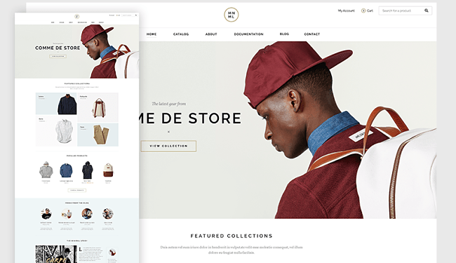
<?xml version="1.0" encoding="UTF-8"?>
<?xml-stylesheet type="text/xsl" media="screen" href="/~d/styles/rss2full.xsl"?><?xml-stylesheet type="text/css" media="screen" href="http://feeds.feedburner.com/~d/styles/itemcontent.css"?><rss xmlns:content="http://purl.org/rss/1.0/modules/content/" xmlns:wfw="http://wellformedweb.org/CommentAPI/" xmlns:dc="http://purl.org/dc/elements/1.1/" xmlns:atom="http://www.w3.org/2005/Atom" xmlns:sy="http://purl.org/rss/1.0/modules/syndication/" xmlns:slash="http://purl.org/rss/1.0/modules/slash/" xmlns:feedburner="http://rssnamespace.org/feedburner/ext/1.0" version="2.0">

<channel>
	<title>Inspired Magazine</title>
	
	<link>http://inspiredm.com</link>
	<description>creativity lifestyle</description>
	<lastBuildDate>Fri, 25 May 2012 00:09:33 +0000</lastBuildDate>
	<language>en</language>
	<sy:updatePeriod>hourly</sy:updatePeriod>
	<sy:updateFrequency>1</sy:updateFrequency>
	<generator>http://wordpress.org/?v=3.3.2</generator>
		<atom10:link xmlns:atom10="http://www.w3.org/2005/Atom" rel="self" type="application/rss+xml" href="http://feeds.feedburner.com/InspiredMagazine" /><feedburner:info uri="inspiredmagazine" /><atom10:link xmlns:atom10="http://www.w3.org/2005/Atom" rel="hub" href="http://pubsubhubbub.appspot.com/" /><feedburner:emailServiceId>InspiredMagazine</feedburner:emailServiceId><feedburner:feedburnerHostname>http://feedburner.google.com</feedburner:feedburnerHostname><item>
		<title>Mobile: A Serious Contender to the Desktop Computer</title>
		<link>http://feedproxy.google.com/~r/InspiredMagazine/~3/om366E935Go/</link>
		<comments>http://inspiredm.com/mobile-a-serious-contender-to-the-desktop-computer/#comments</comments>
		<pubDate>Thu, 24 May 2012 23:05:04 +0000</pubDate>
		<dc:creator>Chris Kinsey</dc:creator>
				<category><![CDATA[Articles]]></category>
		<category><![CDATA[Web Design]]></category>
		<category><![CDATA[apps]]></category>
		<category><![CDATA[design]]></category>
		<category><![CDATA[design trends]]></category>
		<category><![CDATA[Facebook]]></category>
		<category><![CDATA[fluid layout]]></category>
		<category><![CDATA[ipad]]></category>
		<category><![CDATA[iPhone]]></category>
		<category><![CDATA[mobile adaptable]]></category>
		<category><![CDATA[mobile browsers]]></category>
		<category><![CDATA[mobile challenges]]></category>
		<category><![CDATA[mobile design]]></category>
		<category><![CDATA[mobile devices]]></category>
		<category><![CDATA[mobile news]]></category>
		<category><![CDATA[mobile responsive]]></category>
		<category><![CDATA[semantic web]]></category>
		<category><![CDATA[social media]]></category>
		<category><![CDATA[texture]]></category>
		<category><![CDATA[trends]]></category>
		<category><![CDATA[Twitter]]></category>
		<category><![CDATA[user experience]]></category>

		<guid isPermaLink="false">http://inspiredm.com/?p=22856</guid>
		<description><![CDATA[<p><a href='http://rss.buysellads.com/click.php?z=1260129&k=a3140f35ab5e285488fecad937a28609&a=22856&c=868535848' target='_blank' rel='nofollow'>
				<img src='http://rss.buysellads.com/img.php?z=1260129&k=a3140f35ab5e285488fecad937a28609&a=22856&c=868535848' border='0' alt='' /></a></p><br />This is a guest post by Chris Kinsey - a Digital Designer for Sixth Story / @sixth_story &#8211; a UK based Branding &#38; Communications agency based in Birmingham. He is fuelled by tea and charged with driving strategy and innovation to this forward thinking creative agency. Mobile is certainly the big craze at the moment in the [...]<p>This is a post from <a href="http://www.inspiredm.com">Inspired Magazine</a>. If you like it, you may want to subscribe to our <a href="http://feeds2.feedburner.com/InspiredMagazine" target="_blank">RSS full feed</a> to be updated on every article we're publishing. Also, it's highly recommended to follow us <a href="http://twitter.com/inspiredm" target="_blank">on Twitter</a>!<br/><br/><a href="http://inspiredm.com/mobile-a-serious-contender-to-the-desktop-computer/">Mobile: A Serious Contender to the Desktop Computer</a></p>
]]></description>
			<content:encoded><![CDATA[
<p><a href="http://feedads.g.doubleclick.net/~a/sNgAX3Gs6Y1AlAgOxeyTFfYZOx0/0/da"><img src="http://feedads.g.doubleclick.net/~a/sNgAX3Gs6Y1AlAgOxeyTFfYZOx0/0/di" border="0" ismap="true"></img></a><br/>
<a href="http://feedads.g.doubleclick.net/~a/sNgAX3Gs6Y1AlAgOxeyTFfYZOx0/1/da"><img src="http://feedads.g.doubleclick.net/~a/sNgAX3Gs6Y1AlAgOxeyTFfYZOx0/1/di" border="0" ismap="true"></img></a></p><p><a href='http://rss.buysellads.com/click.php?z=1260129&k=a3140f35ab5e285488fecad937a28609&a=22856&c=344973975' target='_blank' rel='nofollow'>
				<img src='http://rss.buysellads.com/img.php?z=1260129&k=a3140f35ab5e285488fecad937a28609&a=22856&c=344973975' border='0' alt='' /></a></p><br /><p><em>This is a guest post by <a target="_blank" href="https://twitter.com/#!/nympfo" target="_blank">Chris Kinsey</a> - a Digital Designer for <a target="_blank" href="http://www.sixthstory.co.uk/" target="_blank">Sixth Story</a> / <a target="_blank" href="https://twitter.com/#!/sixth_story" target="_blank">@sixth_story</a> &#8211; a UK based Branding &amp; Communications agency based in Birmingham. He is fuelled by tea and charged with driving strategy and innovation to this forward thinking creative agency.</em></p>
<p>Mobile is certainly the big craze at the moment in the web industry. With the introduction of mobile devices such as the iPhone, iPad, and various other smart phones and tablets, the demand for websites to be ‘mobile friendly’ has never been greater. The purpose of this article is to highlight the impact mobile devices have had on web design in recent years. The article looks at various aspects such as best practices, challenges and design trends as well as taking a look at what may lie ahead for the future of mobile web design.</p>
<h2><strong>Mobile Conception</strong></h2>
<p>Motorola launched the world’s first commercially available mobile telephone, the DynaTAC 8000X, in 1983. Despite initially being affordable only to a privileged few and, by today’s standards, little about the device actually lending itself to mobility – not least its unwieldy brick-like size and weight – the Motorola 8000X nevertheless represented a major world-changing advance in the way we communicate.</p>
<p>In the 30 years or so since the 8000X went on sale, much has changed. For a start, the definition of the term ‘mobile technology’ has expanded beyond the scope of the telephone to include an evermore-diverse and sophisticated array of devices ranging from tablet PCs to eBook readers to so-called smart phones. Alongside other impressive capabilities such as allowing users to take and share high-definition photographs, read books, ascertain ones location down to a few metre’s, play movies and music and, even access the internet, that of making and receiving calls today seems a somewhat insignificant, easily overlooked feature of what now essentially amount to small, albeit ferociously powerful, personal computers.</p>
<p>The personal computer that has dominated our lives up until now has been, without doubt, the desktop computer, the experience of accessing the Internet on a mobile device having traditionally been fraught with difficulties and, more often than not, one characterised by intense disappointment. Yet with the help of advances in mobile hardware as well as software, the increasing availability of wireless, 3G and even 4G high-speed Internet, not to mention increased awareness and cooperation on behalf of designers and developers themselves, things are beginning to change fast with mobile devices now emerging as serious contenders to the desktop computer.</p>
<p>In 2009, <a target="_blank" title="Goldman Sachs" href="http://www.goldmansachs.com/" target="_blank">Goldman Sachs</a> economist, Mary Meek, predicted that over the following five years more users would begin to connect to the Internet through a mobile device than on a desktop computer. As of 2012, there are already more smart phones being sold worldwide than desktops with <a target="_blank" title="Gartners" href="http://www.mediapost.com/publications/article/120590/" target="_blank">Gartner’s</a>, one of the world’s leading IT research companies, predicting that mobiles will, ahead of schedule, surpass personal computers as the most common means of accessing the web. Meek has argued that the world is currently in the midst of its fifth major technology cycle of the past half century, the Mobile Internet Era – the four prior to it being the mainframe era of the 1950s and 60s, the mini-computer era of the 1970s, the desktop computer era of the 1980s and the desktop internet era of the 1990s and 2000s. If this cycle is as big as its four predecessors – and the sheer numbers involved suggest it will be even bigger – then those able to rise to the challenge of providing what users want, when they want it, will be more than compensated for their efforts.</p>
<p>The problem is that, until recently, few businesses, designers and developers have been able to fully grasp the importance of what is happening, many of them choosing to ignore the medium entirely. Designing for mobile devices presents its own unique challenges separate from those encountered when designing for the desktop, not least of all that of having to contend with a smaller screen.</p>
<p>Nevertheless, in the words of mobile Internet design expert, <a target="_blank" title="Luke Wroblewski" href="http://www.lukew.com/" target="_blank">Luke Wroblewski</a>, “Mobile, if it happened at all, has been a port of the desktop version that was conceived of, designed and built before anyone even considered the mobile experience.” Additional problems arise when considering the sobering fact that the vast majority of users do not yet own devices as feature-rich and technically competent as the iPhone 4S, which, like the 8000X back in the eighties, today still remains predominantly the preserve of the relatively wealthy.</p>
<p>Yet from a business perspective, it is hugely important to try and establish a strategy aimed at satisfying the demands of all elements of this increasingly important, growing target market, not just a privileged few. As many key players in the industry have already said, those involved in coming up with such strategies will, ultimately, have to start to do this by reversing the current trend of focusing on the desktop and begin designing for the mobile first.</p>
<div>
<h2><strong>The Growth of Mobile Web</strong></h2>
</div>
<p>We can divide mobile devices capable of surfing the web into three categories: feature phones, smart phones and touch phones. As the definition of mobile devices widens, however, this description seems rather limiting. Instead of listing every single feature of every mobile device on the market, it is perhaps best to categorise them as follows.</p>
<ul>
<li><strong>Mobile Phones</strong> – phones with call and SMS support.</li>
<li><strong>Low-end Mobile devices</strong> – phones with web browser, basic camera, basic music player, no touch support and limited memory.</li>
<li><strong>Middle-end mobile devices</strong> – phones with medium-sized screens, basic HTML browser support, decent camera, music player, games, applications, and sometimes 3G.</li>
<li><strong>High-end mobile devices</strong> – non-multitouch phones with accelerometer, good camera, Bluetooth, good web support, generally not sold with flat Internet rates.</li>
<li><strong>Smart phones</strong>  – phones with multitasking OS, full desktop browser, WLAN, 3G, music player and often GPS, digital compass, video-capable camera, and many other features, which could include touch support.</li>
<li><strong>Non-phone devices</strong> – small personal object technologies (SPOTs), tablets, netbooks, and notebooks, (e.g. iPod and iPad).</li>
</ul>
<p>The vast majority of people, however, still refer generically to all but the last as mobile phones.<img class="alignright size-medium wp-image-22875" title="Differing Devices &amp; Desktop Computer" src="http://inspiredm.com/wp-content/uploads/2012/05/devices1-300x199.jpg" alt="" width="300" height="199" /></p>
<p>Since their emergence in the 1980s, the unprecedented speed at which mobile technology has evolved has resulted in an astonishing array of ever smaller, more portable and more powerful devices. <span style="text-decoration: underline;"><a target="_blank" title="Ahonen" href="http://www.tomiahonen.com/" target="_blank">Ahonen</a></span> illustrated this dramatic trend by way of comparison with other key technologies widely considered to have affected seismic social, technological and economic change, such as the automobile, television and desktop computer and, in doing so, showed to what extent the mobile phone has become such a cornerstone of our lives, in such a comparatively short amount of time.</p>
<p><a href="http://inspiredm.com/wp-content/uploads/2012/05/growth.jpg"><img class=" wp-image-22859 alignleft" title="The Growth of the Mobile Phone" src="http://inspiredm.com/wp-content/uploads/2012/05/growth-300x130.jpg" alt="" width="300" height="130" /></a></p>
<p>According to a study by the <span style="text-decoration: underline;"><a target="_blank" title="International Telecommunications Union" href="http://www.itu.int/newsroom/press_releases/2010/06.html" target="_blank">International Telecommunications Union</a></span>, in 2010 there were some 5 billion active mobile subscriptions worldwide, a figure that equates to 77% of the world’s total population. In just three years since Ahonen made his comparison, the number of subscriptions worldwide had practically doubled and this is a trend that shows every intention of continuing as the market nears total saturation.</p>
<p>In terms of both revenues and subscribers, the United Kingdom is one of Europe’s largest mobile markets. With a total of 76.4m subscribers in 2011, there are now over five million more subscriptions in the country than there are people. An estimated 9 in 10 UK residents now own at least one handset, many owning several.</p>
<p>As the infrastructure required for such devices to function makes its way to some of the world’s more remote and disadvantaged regions (currently around 90% of the world enjoys mobile phone coverage) and mobile technology itself both improves and comes down in price, the developing world is catching up fast with the fastest growth today seen in Africa. There, the number of subscribers is set to hit <span style="text-decoration: underline;"><a target="_blank" title="735 million by the end of 2012" href="http://www.dailymail.co.uk/sciencetech/article-2059741/Mobile-market-booms-Africa-735-million-using-phones-banking-mini-cinemas.html" target="_blank">735 million by the end of 2012</a></span>, the market having grown by a steady 20% for each of the past five years.</p>
<p>Of course, as this technology becomes more prevalent, so does the number of people using it to access the Internet. 85% percent of handsets produced in 2011 will be web-enabled according to <span style="text-decoration: underline;"><a target="_blank" title="MobiThinking" href="http://mobithinking.com" target="_blank">MobiThinking</a></span>. From a business perspective, this is by far the most interesting aspect of all.</p>
<p>There is a significant relationship between the surge in mobile Internet and its increasing economic accessibility, but the most important factor relates to the inherent portability and interactivity offered by the medium itself. These are both distinct advantages over desktop computers, a form of technology, which, essentially, tethers its users to a single location.</p>
<p>Worldwide, a total of <span style="text-decoration: underline;"><a target="_blank" title="one billion" href="http://www.mobile88.com/news/read.asp?file=/2011/1/28/20110127212155&amp;phone" target="_blank">one billion</a></span> are set to use mobile devices as their primary means of accessing the web by 2015. In the UK, Research conducted by <span style="text-decoration: underline;"><a target="_blank" title="Tecmark" href="http://www.tecmark.co.uk/uk-mobile-stats-2011" target="_blank">Tecmark</a></span> shows that 12.59% of all UK web traffic now comes from mobile devices. This equated to over 4000% growth in the proportion of UK web traffic accounted for by mobile devices, the number having jumped from 00.2% in September 2009 to 12.59% in August 2011.</p>
<p>By analyzing UK mobile web traffic, Tecmark were able to ascertain that Apple devices account for the lion’s share of access, with 58% of mobile visits coming from iPhones and an additional 17% from iPad’s. 14.6% of mobile web visits were visited by Android devices and 3.5% by BlackBerrys, which were noted as declining.</p>
<div>
<h2><strong>What are mobile devices being used for?</strong></h2>
<p>Given the qualities distinct to mobile devices, such as their small size, portability and increasingly sophisticated features like high-end cameras and GPS, it would be a mistake to regard them merely as substitutes for desktop computers. As well as for regular browsing, the following summarises some of the most popular uses for mobile devices to date.</p>
<div>
<p><strong>Geolocation Services</strong></p>
</div>
<p>As well as assisting with navigation, built-in Global Positioning System (GPS) receivers allow users to receive targeted, timely and location-relevant services to their devices such as news, weather, information from local businesses and even the whereabouts of nearby friends.</p>
<div>
<p><strong>Social Networking and Instant Messaging</strong></p>
</div>
<p><a href="http://inspiredm.com/wp-content/uploads/2012/05/social_icons.jpg"><img class="alignright size-medium wp-image-22862" title="Social networking apps on iPhone 4" src="http://inspiredm.com/wp-content/uploads/2012/05/social_icons-200x300.jpg" alt="" width="200" height="300" /></a></p>
<p>Access to social networking sites such as Facebook is proving increasingly popular. By allowing users to report on life as it happens (uploading photographs to Flickr or Facebook, for example, literally seconds after they are taken), social networking is, in many ways, finally being unleashed to achieve its full potential. Users accessing Facebook via a mobile browser grew 112 % in 2009 and access to Twitter via a mobile browser grew by 347%.  There are more than 100 million active users currently accessing Facebook through mobile devices. These users are twice as active as non-mobile users.</p>
<p>Instant messaging, already an established favourite on desktop computers, is also naturally suited for mobiles. Unlike traditional text messages, users can send messages as part of their data plan to anywhere in the world, regardless of mobile carrier. The same, of course, applies to e-mail.</p>
<div>
<p><strong>Shopping</strong></p>
</div>
<p>According to <span style="text-decoration: underline;"><a target="_blank" title="Adobe’s Mobile Shopper Insights for 2011" href="http://www.scene7.com/report/AdobeScene7_Mobile_Shoppers_Insights.pdf" target="_blank">Adobe’s Mobile Shopper Insights for 2011</a></span>, 46% of users shop online for an hour, on average, a week. It is becoming common for shoppers to research a product at the point of decision “transforming the way consumers shop and interact with brands”.</p>
<div>
<p><strong>On-the-Go Uses</strong></p>
</div>
<p>In addition to the above, mobile devices are especially good at performing a number of on-the-go activities such as checking transport times, news, restaurant reviews, price comparisons, online banking, watching video, playing games and a great deal more.</p>
<div>
<p><strong>Bridging the Gap</strong></p>
</div>
<p>Essentially the biggest advancement in mobile devices has been bridging the gap between the mobile and desktop web experience. Google, Amazon, Wikipedia, eBay, YouTube, and Facebook are a few main representatives of Web 2.0, whereby the smart phone and mobile device revolution has eventually moved the web, from our desks, to our pockets. As Web 3.0 accelerates the convergence of the web with our daily lives, mobile devices will lead the way.</p>
<div>
<h2><strong>Overcoming the Challenges of the Mobile Web</strong></h2>
</div>
<div>
<p><strong>Challenges</strong></p>
<p>Owing to a number of factors, not least the hugely reduced size of the screens on mobile devices and stark software and hardware compatibility issues, designing for this medium presents an entirely different set of challenges for designers compared to those commonly encountered when designing for the desktop. The following are some of the most common issues.</p>
<div>
<p><strong>Screen Size and Resolution</strong></p>
</div>
<p>By their very nature, mobile devices have small screens. The iPhone 4S, for example, has a screen size of 960 x 640 pixels and that of its main rival, the Galaxy Nexus, is larger still at 720 x 1280. More basic devices, however, possess screens as small as 240 x 240. Typically, websites are not optimised for small screens.</p>
<div>
<p><strong>Operating Systems</strong></p>
</div>
<p>According to <span style="text-decoration: underline;"><a target="_blank" title="Infosec Island" href="http://www.infosecisland.com/blogview/13101-Top-Five-Mobile-Operating-System-Options.html" target="_blank">Infosec Island</a></span>, the most commonly used operating systems on mobile devices can be narrowed down to five: Symbian (33%), Windows Mobile 7 (-5%), Blackberry Rim (15%), Apple iOS (16%) and Google Android (33%). In addition, a number of proprietary operating systems exist. Such variety creates a constant challenge for designers and developers respectively.</p>
<div>
<p><strong>Devices and Navigation</strong></p>
</div>
<p>Referred to earlier, there are literally thousands of different makes and models of mobile devices on the market today, all with distinct features, advantages and disadvantages. At the high end of the market are multitouch devices that allow people to use either fingers or styluses to navigate the interface. Such devices may or may not also feature a traditional, physical QWERTY-style keyboard. Not all mobile devices have touch screen interfaces. Many feature trackballs, joysticks or directional keys. For this reason user navigation can often become more of a hindrance than help to the end user if a particular website is setup for certain devices in mind.</p>
<div>
<p><strong>Browsers</strong></p>
</div>
<p>The overwhelming challenge with mobile web design is the lack of standardisation across web browsers. The desktop browser world is relatively simple with the leading browsers being Internet Explorer, Firefox, Safari, Opera, and Chrome (in no particular order). There are currently around 25 mobile browsers in common usage. It can be confusing for web developers to decide which standards to obey and which users to serve. Safari on iOS was and maybe still is currently the only mobile browser to support a range of new features, including those that allow us to create animations, transitions, 3D, and Flash-like experiences using HTML5, JavaScript, CSS3 and jQuery, but without the use of Flash.</p>
<div>
<h2><strong>The Importance of User Experience</strong></h2>
</div>
<p>Writers in the field of Human-Computer Interaction (HCI) have written extensively on the topic of User Experience, a concept that lies at the heart of mobile web development. According to <span style="text-decoration: underline;"><a target="_blank" title="Cameron Moll" href="http://cameronmoll.com/" target="_blank">Cameron Moll</a></span>, this experience is “context, content and component sensitive,” meaning that it is predominantly influenced by a user’s environment (context), the relevance of information accessed to the task at hand (content) and the feature capabilities of the device being used. These are the factors that businesses and designers alike must take into account.</p>
<p>‘Mobile’ should refer to the user, and not the device or the application. All too often designers and developers have treated the mobile environment and technology as a subset of the desktop environment and fail to consider the strengths and weaknesses of a mobile device. <span style="text-decoration: underline;"><a target="_blank" title="Cameron Moll" href="http://cameronmoll.com/" target="_blank">Cameron Moll</a></span> described this mindset as “PC nearsightedness”. For the mobile Internet to flourish and truly come into its own, the UX must become the central element around which all others revolve. Put simply, designers must start to “mobilize not miniaturize,” thereby precisely targeting mobile user needs, making the best possible use of technology.</p>
<div>
<h2><strong>‘One Web’</strong></h2>
</div>
<p>Since 2005, the <a target="_blank" title="World Wide Web Consortium" href="http://www.w3.org/TR/mobile-bp/" target="_blank"><span style="text-decoration: underline;">World Wide Web Consortium</span> </a>(W3C) has promoted the idea of ‘One Web’ as a means to make the web available to everyone, regardless of his or her device. Initially, the mission statement of ‘One Web’ was defined as follows. “One Web means making the same information and services available to users, irrespective of the device they are using” which was later revised to include the lines, “as far as reasonable” and “does not mean that exactly the same information is available in exactly the same representation across all devices.”</p>
<p>It is a noble goal but ‘One Web’ is based on a number of flawed assumptions, namely that content for multi contexts will always be the same, cost per kilobyte per user will be minimal or non-existent, an always-on, high-speed data network will always be available, mobile browsers will always support the same standards consistently and technology-based principles should always come before the needs of the user. The first four will eventually be outdated, but the last will always remain questionable.</p>
<p>Flawed assumptions or not, the general underlying sentiment is that designers should avoid making assumptions about their users and instead labour to minimise the differences and maximise the similarities across mobile devices.</p>
<div>
<h2><strong>Best Practices</strong></h2>
</div>
<p>Last updated in July 2008, <span style="text-decoration: underline;"><a target="_blank" title="W3C’s Mobile Web Best Practices" href="http://www.w3.org/TR/mobile-bp/" target="_blank">W3C’s Mobile Web Best Practices</a></span>, a list of 60 best practices, has been referred to frequently. According to the MWBP, the top ten such practices (still largely relevant today and as much a case of common sense than anything else) are as follows.</p>
<ul>
<li>Design for ‘One Web’</li>
<li>Rely on Web Standards</li>
<li>Stay Away from Known Hazards</li>
<li>Be Cautious of Device Limitations</li>
<li>Optimise Navigation</li>
<li>Check Graphics and Colours</li>
<li>Keep it Small</li>
<li>Use the Network Sparingly</li>
<li>Help and Guide User Input</li>
<li>Think of Users on the Go</li>
</ul>
<div>
<h2><strong>Current Practices</strong></h2>
</div>
<p>Though a truly vast subject area that would have you reading for hours upon end, the following provides the briefest of overviews with regard to current practices and design trends.</p>
<div>
<p><strong>‘Mobile Friendly’ or ‘Mobile Responsive’ Websites</strong></p>
</div>
<p>The terms “Mobile Friendly” or “Mobile Responsive” refer to websites, which adapt to the user no matter the screen size or device they are using. Before looking at design trends, it is important to first mention that there are different directions a designer and developer can take when constructing a mobile website: the most common being touch optimised frameworks and responsive web design.</p>
<div>
<p><strong>Responsive Web Design</strong></p>
</div>
<p>Responsive Web Design conforms very much to the ‘One Web’ principle where the end user is only ever dealing with one website, unlike with a Touch Optimised Framework which may be setup to forward users on mobile devices to a particular domain, sub domain or directory. Responsive web design works through setting percentages and media queries within the websites CSS. When an end user visits the website on a smaller mobile device, the website will automatically determine what screen size they are using (media queries) and adjust accordingly. The page elements can be set using percentages rather than fixed width and height pixel dimensions. Therefore, the elements scale in size dependant upon the device viewing it. Many mobile devices are also able to switch the orientation from portrait to landscape. A mobile website will need to allow for this and scale/adjust accordingly. Touch optimised websites and responsive web design generally both cater for this type of functionality. The latter, however, is essentially the most cost effective and logical approach to mobile web design (in my opinion).</p>
<div>
<p><strong>Touch Optimised Frameworks</strong></p>
</div>
<p>Touch optimised frameworks such as <span style="text-decoration: underline;"><a target="_blank" title="jQueryMobile" href="http://jquerymobile.com" target="_blank">jQueryMobile</a></span> and <span style="text-decoration: underline;"><a target="_blank" title="Sencha Touch" href="http://www.sencha.com/products/touch/" target="_blank">Sencha Touch</a></span> enable developers to work from a framework that is specifically compatible with a multitude of mobile devices, mobile operating systems and mobile browsers. The framework utilises the latest HTML5 and jQuery technology but it is also backwards compatible with HTML4 meaning mobile operating systems with browsers that do not support HTML5 will still work, appealing to a larger target audience. Most importantly it offers ‘app’ like transitions (such as slide, fade, pop and flip) that give the impression the user is operating something similar to a native ‘app’ from within a mobile browser.</p>
<p>There are clear advantages to touch optimised frameworks, including: quicker turn around, they are significantly cheaper than a native ‘app’, the website runs through a browser meaning it’s easier to make multi-platform, you can direct users to a specific web address and so cut out the ‘middle man’ of having to download an app from an app-store, and you can make the framework content-managed enabling the content to be changed without having to pay a company to recompile an ‘app’ equivalent. Touch-optimised frameworks are also usually compatible with non-touch optimised mobile devices.</p>
<div>
<h2><strong>Design Trends</strong></h2>
</div>
<p>Now the direction a designer and developer may take when constructing a ‘Mobile Friendly’ website has been highlighted, it is imperative to look at the current trends and best practices which craft the website into a finalised design. The following approach will take into account the challenges, which have been previously listed.</p>
<div>
<h2><strong>Minimalism &amp; Navigation</strong></h2>
</div>
<p>A simplistic and minimalistic approach is vital when designing for the mobile web. This can often be achieved by stripping out the content to what is, essentially, key information. <span style="text-decoration: underline;"><a target="_blank" title="Page Progressive" href="http://www.pageprogressive.com/news/blog/7-mobile-website-design-trends/" target="_blank">Page Progressive</a></span> suggests streamlining the information and choices available so that today’s busy consumers don’t have to spend a lot of time sorting through excessive info. Choose function over extra features for a scaled down mobile website.</p>
<p>It’s important to keep it quick and minimal, provide only key information, optimise any images and break up long pages into bite-sized chunks. Ensure the navigation is simple, easy to get to and from pages, and buttons are easily clickable.</p>
<p>Some may argue a website should not have information removed when viewing on a mobile device, but in my own opinion, low priority content should be removed – creating an easier to read and move around experience, as well as quicker loading on devices, which sometimes suffer from slow Internet connection speeds. The same simplistic and easy to use approach should also be applied into the navigation with touch optimised and non-touch optimised devices in mind. Positioning the navigation will not be exactly the same compared to a desktop equivalent. If the navigation is positioned at the top, the key content will be pushed further down the page. This can be avoided by placing content before the navigation or using drop down links.</p>
<p>Organisation should also be applied with minimalism. Grid systems are a great way to keep everything organised within a web page. Users often like content in columns, navigation by horizontal bar and vertical link lists. On screen element proportion is crucial. Users who have to zoom excessively, hiding the rest of the page, are not receiving the best overall user experience.</p>
<div>
<p><strong>Optimised Pages &amp; Prioritised Content</strong></p>
</div>
<p><img class="alignright size-medium wp-image-22858" title="Mobile: A Serious Contender to the Desktop Computer" src="http://inspiredm.com/wp-content/uploads/2012/05/ipad-300x199.jpg" alt="" width="300" height="199" />Page load times and images should be correctly optimised when designing for the mobile web. Reducing the overall load time of a website will help avoid high bounce rates. Mobile websites have to bare in mind the end users varying Internet speeds. Therefore minimal use of imagery is essential. Imagery, which is required, should be optimised accordingly and reduced in file size to improve loading times.</p>
<p>An alternative method of reducing page load time is with Ajax. Ajax increases the responsiveness of a web application, and these benefits warrant merit for the mobile web, as the traditional click-refresh, click-refresh browsing experience can be painfully slow on a mobile device. Designing for the smaller screen device requires further attention to what is actually displayed. Whilst minimalism and simplistic methods have been mentioned, it is important to ensure there is enough prioritised content on the screen, which interests and is relevant to the end user.</p>
<div>
<p><strong>Social Media Integration</strong></p>
</div>
<p>Social media integration is something which cannot be avoided if any business or individual wants their website to be found. Seamlessly integrating social networks such as Facebook, Twitter, Google+ will enable visiting users to share content, potentially advertise a product/service to their followers/friends, whilst increasing brand awareness at the same time.</p>
<div>
<p><strong>Native App Design Inspiration</strong></p>
</div>
<p><img class="alignleft" title="Forefathers Group - Texture in Responsive Web Design" src="http://inspiredm.com/wp-content/uploads/2012/05/forefathers-204x300.jpg" alt="" width="204" height="300" />A vast majority of recent mobile website designs seem to take heavy inspiration from native app user interfaces. Mobile website designers are creating pages that adapt menu items into button or icon systems similar to those used in apps for a clean icon driven design.</p>
<p>Textures are also commonly used within native app design and these are starting to surface within mobile websites. Texture is often used as a design device to add dimension, depth, or simply to inject life into a bland design.<br />
Texture play’s a key role in how users interact with mobile websites. As the standard display of a mobile device is relatively small compared to a desktop equivalent the user most often than not has to touch the screen to navigate and interact. Therefore, there is no mouse or hover states that informs users whether an element can be clicked. With touch screen devices you can do more than just touch, you can move, scroll, expand and pinch elements on screen. As users of real life, physical objects, we interact with textures everyday. Creating textures for on screen elements that can be manipulated by the user is becoming more important and goes one step further in merging the gap between real life and technology.</p>
<div>
<p><strong>The Future of the Mobile Web?</strong></p>
</div>
<p>As mobile devices become more and more popular as a means of accessing the Internet, designers and developers can no longer ignore the fact that mobile design is a field in its own right, quite separate from that geared mainly towards the desktop. Designing for mobile devices presents its own unique challenges that necessitate their own specific solutions.</p>
<p>The most obvious challenges emanate from the small size of mobile devices compared to their larger desktop rivals. Designing for the idiosyncratically small screens found on mobile devices, for example, requires a completely different approach to that of designing for a desktop due to the far greater constraints on space. Mobile website layouts must, therefore, be minimalist and content should be concise and, most important of all, mindful of the oft-cited concept of context.</p>
<p>Observing such basic criteria also has the knock-on effect of anticipating for mobile Internet connections. Although vastly improved in recent years, certain parts of the world remain expensive and have a greater propensity for inconsistencies in performance.</p>
<p>From the perspective of interactivity, in the absence of a (full-sized) keyboard and a mouse, forms of navigation suited to the desktop are less useful for mobile users. The different forms of input found on small devices require designers and developers to think differently about the optimal way for users to navigate a given site. In short, navigation on a mobile device needs to be intuitive and consistent with providing an optimum user experience.</p>
<p>Whilst issues surrounding device and software incompatibilities will gradually become less and less relevant over time, the challenges cited, however, are inherent to the technology. Where as it might have been at one time acceptable to take a relaxed attitude to mobile, perhaps taking the easy route of either simply doing nothing or making a few tweaks to a website designed for the desktop in order for it to be viewable on a mobile, this no longer makes sense, not least of all from a business perspective. Businesses that continue to bury their heads in the sand when it comes to the importance of mobile users do so at their own peril. In essence, the web design industry is being forced finally, to “mobilize, not miniaturize”.</p>
<p>Whilst the future is difficult to predict, it is clear to see which areas within the mobile web field will continue to develop further.</p>
<p>First of all, a lot of the groundwork has already been done over the past few years. Advances in HTML5, CSS3, Javascript and jQuery, for example, together with a move towards standardisation in the browser industry, will make the job of the web developer and designer much easier when it comes to making the transition from desktop to mobile. As the process becomes simplified, developers will find it quicker to write and implement code. The industry itself will grow and the once steep learning curve will gradually fall away. All of this will, in turn, result in greater functionality and a much-improved experience for the end user. Web design agencies may incorporate mobile responsive design as standard (some probably already do) into projects meaning that, as websites get deleted from the Internet and others re-designed, near enough all websites will be mobile friendly.</p>
<p>Where websites have traditionally failed to deliver, native apps have become a reliable fallback option or a first choice in their own right. For many people, such apps have taken preference over websites even when available. As websites become closer in terms of features and functionality to such apps, it is possible that they will become less relevant, though it is unlikely that they will die out entirely. A number of apps such as games, dictionaries and other reference materials, for example, are popular precisely because they do not require an Internet connection and can be used offline. A bustling market worth millions currently exists for apps from which thousands of developers are earning a living. Developers could maybe one day earn the same from websites with the same in-built features.</p>
<p>Geolocation services will hold greater significance whilst search engine optimisation will become less important in response to the growth of search engines pushing more location-appropriate information to the end user.</p>
<p>Augmented reality may also finally be utilised to its full potential to give new relevance to our surroundings, perhaps allowing the user to transpose information from the web onto whatever is placed within the device’s camera viewfinder. As the kind of voice technology seen with the iPhone’s Siri application picks up and becomes more and more refined, perhaps users will be able to actually converse with websites with meaningful dialogue, an advance which would make many of the current challenges relating to navigation a thing of the past.</p>
<p>In terms of hardware, emerging technology such as screens with revolutionary new properties such as the ability to be rolled up like a newspaper and display 3D are already on the horizon. When this technology finally matures, maybe web and mobile design may render the printing press almost obsolete as the benefits of a reusable screen become fully apparent? This will prompt a huge shift to web typography as designers attempt to replicate the nostalgic look of traditional, dead-tree magazines and newspapers on screen. Devices and browsers will, in turn, pack far greater support for typography than what they currently do.</p>
<p>As we move into Web 3.0 – the so-called ‘Semantic Web’ – we will see a more intelligent and intuitive Internet, the evolution of which will result in seamless integration with our daily lives. At the forefront of these developments will be mobile devices.</p>
<p style="text-align: right;"><em>header image by <a target="_blank" href="http://www.flickr.com/photos/jonwallace/6770330299/" target="_blank">jonwallace</a></em></p>
</div>
</div>
<p>This is a post from <a target="_blank" href="http://www.inspiredm.com">Inspired Magazine</a>. If you like it, you may want to subscribe to our <a target="_blank" href="http://feeds2.feedburner.com/InspiredMagazine" target="_blank">RSS full feed</a> to be updated on every article we're publishing. Also, it's highly recommended to follow us <a target="_blank" href="http://twitter.com/inspiredm" target="_blank">on Twitter</a>!<br/><br/><a href="http://inspiredm.com/mobile-a-serious-contender-to-the-desktop-computer/">Mobile: A Serious Contender to the Desktop Computer</a></p>
<img src="http://feeds.feedburner.com/~r/InspiredMagazine/~4/om366E935Go" height="1" width="1"/>]]></content:encoded>
			<wfw:commentRss>http://inspiredm.com/mobile-a-serious-contender-to-the-desktop-computer/feed/</wfw:commentRss>
		<slash:comments>0</slash:comments>
		<feedburner:origLink>http://inspiredm.com/mobile-a-serious-contender-to-the-desktop-computer/</feedburner:origLink></item>
		<item>
		<title>Urban inspiration – tracking down the big exhibitions</title>
		<link>http://feedproxy.google.com/~r/InspiredMagazine/~3/D8slhI9x-nA/</link>
		<comments>http://inspiredm.com/urban-inspiration-tracking-down-the-big-exhibitions/#comments</comments>
		<pubDate>Thu, 24 May 2012 00:09:27 +0000</pubDate>
		<dc:creator>anca</dc:creator>
				<category><![CDATA[Articles]]></category>

		<guid isPermaLink="false">http://inspiredm.com/?p=22770</guid>
		<description><![CDATA[<p><a href='http://rss.buysellads.com/click.php?z=1260129&k=a3140f35ab5e285488fecad937a28609&a=22770&c=1016513902' target='_blank' rel='nofollow'>
				<img src='http://rss.buysellads.com/img.php?z=1260129&k=a3140f35ab5e285488fecad937a28609&a=22770&c=1016513902' border='0' alt='' /></a></p><br />A few days ago I was passing by the National Portrait Gallery in London. Two impressive queues were going round the corners of the building. It was sunny and just minutes to 10 am when the gallery opens. In London, it’s normal to have people queuing to visit an exhibition. And it has nothing to [...]<p>This is a post from <a href="http://www.inspiredm.com">Inspired Magazine</a>. If you like it, you may want to subscribe to our <a href="http://feeds2.feedburner.com/InspiredMagazine" target="_blank">RSS full feed</a> to be updated on every article we're publishing. Also, it's highly recommended to follow us <a href="http://twitter.com/inspiredm" target="_blank">on Twitter</a>!<br/><br/><a href="http://inspiredm.com/urban-inspiration-tracking-down-the-big-exhibitions/">Urban inspiration – tracking down the big exhibitions</a></p>
]]></description>
			<content:encoded><![CDATA[
<p><a href="http://feedads.g.doubleclick.net/~a/H3cuDcBxUq8pls3JPyJ_Am1WujY/0/da"><img src="http://feedads.g.doubleclick.net/~a/H3cuDcBxUq8pls3JPyJ_Am1WujY/0/di" border="0" ismap="true"></img></a><br/>
<a href="http://feedads.g.doubleclick.net/~a/H3cuDcBxUq8pls3JPyJ_Am1WujY/1/da"><img src="http://feedads.g.doubleclick.net/~a/H3cuDcBxUq8pls3JPyJ_Am1WujY/1/di" border="0" ismap="true"></img></a></p><p><a href='http://rss.buysellads.com/click.php?z=1260129&k=a3140f35ab5e285488fecad937a28609&a=22770&c=952213800' target='_blank' rel='nofollow'>
				<img src='http://rss.buysellads.com/img.php?z=1260129&k=a3140f35ab5e285488fecad937a28609&a=22770&c=952213800' border='0' alt='' /></a></p><br /><p>A few days ago I was passing by the National <a target="_blank" href="http://www.npg.org.uk/">Portrait Gallery</a> in London. Two impressive queues were going round the corners of the building. It was sunny and just minutes to 10 am when the gallery opens. In London, it’s normal to have people queuing to visit an exhibition. And it has nothing to do with the sun. They would have opened their umbrellas.</p>
<p><img class="aligncenter size-full wp-image-22921" title="freud2" src="http://inspiredm.com/wp-content/uploads/2012/05/freud2.jpg" alt="" width="670" height="442" /></p>
<p>That’s one of the great things about big cities: endless cultural treats, and enough &#8216;spectators&#8217; for endless sold out events. Take David Hockey, one of UK’s most known artists of the last century. His recently finished iPad Yorkshire landscapes exhibition at the <a target="_blank" href="http://www.royalacademy.org.uk/exhibitions/hockney/about-the-exhibition/">Royal Academy</a> of Arts was a hit, with people waiting in line sometimes for hours (winter time!), raving reviews, huge banners across the city’s walls, and plastic bags with colorful landscapes. Of course, a well-oiled marketing machinery can be &#8216;blamed&#8217; for part of the success, but with major artists it&#8217;s not hard to sell out. Maybe because they are such a big inspiration.</p>
<p>I agree, inspiration is an intimate, hard to define and classify experience but if you’re all wound up when faced to masterpieces, not missing the major exhibitions out there is a big plus.</p>
<p>If you happen to be or just pass through London until the end of May, we suggest you don’t miss Lucian <a target="_blank" href="http://www.npg.org.uk/freudsite/index.htm">Freud Portraits</a>. Here you have some incentives. It’s the most ambitious exhibition of his work since 2001, with over 100 paintings, drawings and etchings brought together from around the world. That’s quite unique, as you might never be able to see some of these portraits again. At least in real life.</p>
<p><img class="aligncenter size-full wp-image-22922" title="freud3" src="http://inspiredm.com/wp-content/uploads/2012/05/freud3.jpg" alt="" width="315" height="350" /></p>
<p>Freud (1922-2011) was one of those great realist artists able to create work of striking observational intensity. It is a bit like an overdose of sincerity that stirs the viewer and forces pensive moods. With around 100 human beings staring straight at you from the paintings is a pretty intense encounter that might leave you feeling drained and exposed. There is a fascination in his use of thicker brushes, dense application of pigments, chronological changes in style, sitters and interests. The stories that come with the portraits are just as inspiring as the paintings themselves. From famous people to royalty, family and friends, many wanted to pose for him. Including the Queen. And it’s not a flattering portrait. But then again, you didn’t pose for Freud if you wanted flattery.</p>
<p>The exhibition is not recommended to prudes who think art is just cherubs and apples on a plate. Or to vicars. I’m telling this because although the vicar I heard the other day was impressed with Freud’s talent, he wasn’t particularly fond of his choice of topics.</p>
<p>Whether you’ll like it or not, I don’t know. But I do know that it will stick with you and put more questions and ideas into your head than you may like to believe. Also, we cannot guarantee no queuing at the entrance.</p>
<p>More about other big names in the city soon. Enjoy!<em><br />
</em><br />
<em>National Portrait Gallery, London<br />
Until 27 May 2012</em>
<p>This is a post from <a target="_blank" href="http://www.inspiredm.com">Inspired Magazine</a>. If you like it, you may want to subscribe to our <a target="_blank" href="http://feeds2.feedburner.com/InspiredMagazine" target="_blank">RSS full feed</a> to be updated on every article we're publishing. Also, it's highly recommended to follow us <a target="_blank" href="http://twitter.com/inspiredm" target="_blank">on Twitter</a>!<br/><br/><a href="http://inspiredm.com/urban-inspiration-tracking-down-the-big-exhibitions/">Urban inspiration – tracking down the big exhibitions</a></p>
<img src="http://feeds.feedburner.com/~r/InspiredMagazine/~4/D8slhI9x-nA" height="1" width="1"/>]]></content:encoded>
			<wfw:commentRss>http://inspiredm.com/urban-inspiration-tracking-down-the-big-exhibitions/feed/</wfw:commentRss>
		<slash:comments>0</slash:comments>
		<feedburner:origLink>http://inspiredm.com/urban-inspiration-tracking-down-the-big-exhibitions/</feedburner:origLink></item>
		<item>
		<title>HOW TO: Create a Professional Logo For an App</title>
		<link>http://feedproxy.google.com/~r/InspiredMagazine/~3/otbEetoAeIk/</link>
		<comments>http://inspiredm.com/how-create-logo/#comments</comments>
		<pubDate>Wed, 23 May 2012 13:22:55 +0000</pubDate>
		<dc:creator>heidi</dc:creator>
				<category><![CDATA[Articles]]></category>
		<category><![CDATA[how to create a logo]]></category>
		<category><![CDATA[logo for app]]></category>
		<category><![CDATA[logos for apps]]></category>

		<guid isPermaLink="false">http://inspiredm.com/?p=22779</guid>
		<description><![CDATA[<p><a href='http://rss.buysellads.com/click.php?z=1260129&k=a3140f35ab5e285488fecad937a28609&a=22779&c=1031326740' target='_blank' rel='nofollow'>
				<img src='http://rss.buysellads.com/img.php?z=1260129&k=a3140f35ab5e285488fecad937a28609&a=22779&c=1031326740' border='0' alt='' /></a></p><br />In this tutorial, I&#8217;ll show you how to create a badge-styled logo for a fictional mobile application called Task App. We&#8217;ll be learning how to use Illustrator&#8217;s Blend tool. Preview of Final Results Download the PSD tutorialname.zip &#124; 13 MB Download from Filesonic Download from Website How to Create a Professional Logo For an App [...]<p>This is a post from <a href="http://www.inspiredm.com">Inspired Magazine</a>. If you like it, you may want to subscribe to our <a href="http://feeds2.feedburner.com/InspiredMagazine" target="_blank">RSS full feed</a> to be updated on every article we're publishing. Also, it's highly recommended to follow us <a href="http://twitter.com/inspiredm" target="_blank">on Twitter</a>!<br/><br/><a href="http://inspiredm.com/how-create-logo/">HOW TO: Create a Professional Logo For an App</a></p>
]]></description>
			<content:encoded><![CDATA[
<p><a href="http://feedads.g.doubleclick.net/~a/WHIJsmA_aZfd4kea8N3X4g_3uPg/0/da"><img src="http://feedads.g.doubleclick.net/~a/WHIJsmA_aZfd4kea8N3X4g_3uPg/0/di" border="0" ismap="true"></img></a><br/>
<a href="http://feedads.g.doubleclick.net/~a/WHIJsmA_aZfd4kea8N3X4g_3uPg/1/da"><img src="http://feedads.g.doubleclick.net/~a/WHIJsmA_aZfd4kea8N3X4g_3uPg/1/di" border="0" ismap="true"></img></a></p><p><a href='http://rss.buysellads.com/click.php?z=1260129&k=a3140f35ab5e285488fecad937a28609&a=22779&c=1651958242' target='_blank' rel='nofollow'>
				<img src='http://rss.buysellads.com/img.php?z=1260129&k=a3140f35ab5e285488fecad937a28609&a=22779&c=1651958242' border='0' alt='' /></a></p><br /><p class="intro">In this tutorial, I&#8217;ll show you how to create a badge-styled logo for a fictional mobile application called Task App. We&#8217;ll be learning how to use Illustrator&#8217;s Blend tool.</p>
<h2>Preview of Final Results</h2>
<p class="step"><img src="http://inspiredm.com/wp-content/uploads/2012/05/final-results.jpg" alt="" /></p>
<h2>Download the PSD</h2>
<p class="downloadbox">tutorialname.zip | 13 MB</p>
<p><a target="_blank" href="http://filesonic.com/">Download from Filesonic</a></p>
<p><a target="_blank" href="#">Download from Website</a></p>
<h2>How to Create a Professional Logo For an App</h2>
<h3>Resources</h3>
<ul>
<li><a target="_blank" href="http://www.fontsquirrel.com/fonts/Ballpark/">Ballpark font</a></li>
</ul>
<h3>Step 1</h3>
<p>First, we&#8217;ll need to sketch a few ideas and then send them over to the client for revisions. Let&#8217;s just say he chose to go with badge style, and that he or she didn&#8217;t complain about anything (It&#8217;s all fictional, remeber?).<br />
However, get those analog shetches scanned up and ready to be digitized.</p>
<p class="step"><img src="http://inspiredm.com/wp-content/uploads/2012/05/step-01.jpg" alt="" /></p>
<h3>Step 2</h3>
<p>It&#8217;s recommendable to create logos in vector so they can be resized to virtually any size. We&#8217;re going to use Illustrator for this purpose.<br />
Create a document and import (drag and drop) the scanned sketch into it for reference. Name the layer &#8216;sketch&#8217;, lock it, and create another layer on top of it with name &#8216;logo&#8217;.</p>
<p class="step"><img src="http://inspiredm.com/wp-content/uploads/2012/05/step-02.jpg" alt="" /></p>
<h3>Step 3</h3>
<p>According to the sketch, create a transparent circle with somewhat thick border (I used 4 px). In the centre of it, place text &#8216;Task App&#8217; written in Ballpark font.</p>
<p class="step"><img src="http://inspiredm.com/wp-content/uploads/2012/05/step-03.jpg" alt="" /></p>
<h3>Step 4</h3>
<p>Create a rounded rectangle with parameters on the picture, click &#8216;ok&#8217; and then replicate it four times and position them around the sign.</p>
<p class="step"><img src="http://inspiredm.com/wp-content/uploads/2012/05/step-04.jpg" alt="" /></p>
<h3>Step 5</h3>
<p>Now we&#8217;ll create 8 spots around the sign to make it look like a clock, and we&#8217;ll use blending tool to do it. First create two dots, position them apart and group them together (Ctrl+G).</p>
<p class="step"><img src="http://inspiredm.com/wp-content/uploads/2012/05/step-05.jpg" alt="" /></p>
<h3>Step 6</h3>
<p>Go to Object -&gt; Blend -&gt; Blend Options and set values to the ones used in the picture. Then go to Object -&gt; Blend and click &#8216;Make&#8217;. You&#8217;ll get 8 dots, beautifully arranged in a line.</p>
<p class="step"><img src="http://inspiredm.com/wp-content/uploads/2012/05/step-06.jpg" alt="" /></p>
<h3>Step 7</h3>
<p>Draw another cicle on top of the sign to create the base for dots. Then select the circle and dots and go Object -&gt; Blend -&gt; Replace Spine to make them follow it.</p>
<p class="step"><img src="http://inspiredm.com/wp-content/uploads/2012/05/step-07.jpg" alt="" /></p>
<h3>Step 8</h3>
<p>You&#8217;ll need to fix that quarter of circle that circles didn&#8217;t fill. You do that by selecting the Scissors Tool (C) and clicking in the middle of the top dot.</p>
<p class="step"><img src="http://inspiredm.com/wp-content/uploads/2012/05/step-08.jpg" alt="" /></p>
<h3>Step 9</h3>
<p>Adjust the rotation and size of the blend to make it look a little bit like a pizza.</p>
<p class="step"><img src="http://inspiredm.com/wp-content/uploads/2012/05/step-09.jpg" alt="" /></p>
<h3>Step 10</h3>
<p>The easiest way to make the badge-sort of shape is by using the star tool and I recommend you to do so.</p>
<p class="step"><img src="http://inspiredm.com/wp-content/uploads/2012/05/step-11.jpg" alt="" /></p>
<h3>Step 11</h3>
<p>Select the &#8216;pizza&#8217; shape we created previously (all of it) and go to Object -&gt; Expand and click &#8216;Ok&#8217;. Then group them together and go to Effect -&gt; Pathfinder -&gt; Merge.<br />
This will cause all the elements to behave like a single shape &#8211; try changing its color.</p>
<p class="step"><img src="http://inspiredm.com/wp-content/uploads/2012/05/step-12.jpg" alt="" /></p>
<h3>Step 12</h3>
<p>Now drag it above the badge shape we created (Use Right Click -&gt; Arrange -&gt; Bring to front to see what you&#8217;re doing) and group them toghether when you&#8217;re satisfied with the look.<br />
Go to Effect -&gt; Pathfinder once again and select &#8216;Subtract&#8217;.</p>
<h3>Step 13</h3>
<p>You can now paste the design into Photoshop, apply some effects and play with color variations.</p>
<p class="step"><img src="http://inspiredm.com/wp-content/uploads/2012/05/step-13.jpg" alt="" /></p>
<h2>Final Results</h2>
<p class="step"><img src="http://inspiredm.com/wp-content/uploads/2012/05/final-results.jpg" alt="" /></p>
<h2>Download the PSD</h2>
<p class="box-download"><a target="_blank" href="#">filename.psd</a> | 9 MB</p>
<h2>Authors Comment</h2>
<div class="authorcomment">
<p><img src="http://inspiredm.com/wp-content/uploads/2012/05/profile.jpg" alt="" />Author&#8217;s desc</p>
<p>- aShocka</p>
</div>
<p>This is a post from <a target="_blank" href="http://www.inspiredm.com">Inspired Magazine</a>. If you like it, you may want to subscribe to our <a target="_blank" href="http://feeds2.feedburner.com/InspiredMagazine" target="_blank">RSS full feed</a> to be updated on every article we're publishing. Also, it's highly recommended to follow us <a target="_blank" href="http://twitter.com/inspiredm" target="_blank">on Twitter</a>!<br/><br/><a href="http://inspiredm.com/how-create-logo/">HOW TO: Create a Professional Logo For an App</a></p>
<img src="http://feeds.feedburner.com/~r/InspiredMagazine/~4/otbEetoAeIk" height="1" width="1"/>]]></content:encoded>
			<wfw:commentRss>http://inspiredm.com/how-create-logo/feed/</wfw:commentRss>
		<slash:comments>1</slash:comments>
		<feedburner:origLink>http://inspiredm.com/how-create-logo/</feedburner:origLink></item>
		<item>
		<title>Tablets and the Future of Graphic Design</title>
		<link>http://feedproxy.google.com/~r/InspiredMagazine/~3/chYsZiXyotw/</link>
		<comments>http://inspiredm.com/tablets-and-the-future-of-graphic-design/#comments</comments>
		<pubDate>Tue, 22 May 2012 13:42:23 +0000</pubDate>
		<dc:creator>Catalin Zorzini</dc:creator>
				<category><![CDATA[Articles]]></category>

		<guid isPermaLink="false">http://inspiredm.com/?p=22772</guid>
		<description><![CDATA[<p><a href='http://rss.buysellads.com/click.php?z=1260129&k=a3140f35ab5e285488fecad937a28609&a=22772&c=1683620483' target='_blank' rel='nofollow'>
				<img src='http://rss.buysellads.com/img.php?z=1260129&k=a3140f35ab5e285488fecad937a28609&a=22772&c=1683620483' border='0' alt='' /></a></p><br />This is a guest post by Cameron Tyler from Technected - a site dedicated to helpful tech tips and tricks, and innovations in the industry. We always welcome new contributors, so stop by anytime and become a part of our great community! When the iPad first hit the streets, both critics and fans were skeptical of its [...]<p>This is a post from <a href="http://www.inspiredm.com">Inspired Magazine</a>. If you like it, you may want to subscribe to our <a href="http://feeds2.feedburner.com/InspiredMagazine" target="_blank">RSS full feed</a> to be updated on every article we're publishing. Also, it's highly recommended to follow us <a href="http://twitter.com/inspiredm" target="_blank">on Twitter</a>!<br/><br/><a href="http://inspiredm.com/tablets-and-the-future-of-graphic-design/">Tablets and the Future of Graphic Design</a></p>
]]></description>
			<content:encoded><![CDATA[
<p><a href="http://feedads.g.doubleclick.net/~a/DwB3_l6PcvJdO2mqTTa0UgLtZwU/0/da"><img src="http://feedads.g.doubleclick.net/~a/DwB3_l6PcvJdO2mqTTa0UgLtZwU/0/di" border="0" ismap="true"></img></a><br/>
<a href="http://feedads.g.doubleclick.net/~a/DwB3_l6PcvJdO2mqTTa0UgLtZwU/1/da"><img src="http://feedads.g.doubleclick.net/~a/DwB3_l6PcvJdO2mqTTa0UgLtZwU/1/di" border="0" ismap="true"></img></a></p><p><a href='http://rss.buysellads.com/click.php?z=1260129&k=a3140f35ab5e285488fecad937a28609&a=22772&c=513619172' target='_blank' rel='nofollow'>
				<img src='http://rss.buysellads.com/img.php?z=1260129&k=a3140f35ab5e285488fecad937a28609&a=22772&c=513619172' border='0' alt='' /></a></p><br /><p><em>This is a guest post by Cameron Tyler from <a target="_blank" href="http://www.technected.com/" target="_blank">Technected</a> - a site dedicated to helpful tech tips and tricks, and innovations in the industry. We always welcome new contributors, so stop by anytime and become a part of our great community!</em></p>
<p>When the iPad first hit the streets, both critics and fans were skeptical of its ability to ever become a practical computing solution. Now, years after its release, the device has changed the mobile computing landscape and generated some sophisticated applications in business and everyday use. Some uses are more natural than others, and from the outset it wasn’t much of a stretch to consider the device’s impact on the graphic design and artist community. Due to the touch-based nature of the iPad’s screen, art was clearly meant to intersect with the digital realm in the iOS environment. Graphic designers can now perform complex photo editing, and create intricate compositions on the fly with iPad new mobile-based apps like Photoshop Express and Adobe Creative Cloud.</p>
<h2>Why the Cloud Matters to Designers</h2>
<p>Graphic and Web designers traditionally had to spend thousands of dollars on high-powered computer systems, as well as industry-standard design software to stay ahead of the curve. As with any computer-based profession, state-of-the-art software requires lots of processing power. Processing is expensive, especially as computing trends and technology changes so quickly. Cloud-based design applications take the processing ball out of the designer’s court by providing processing resources over several shared servers in a cloud-computing environment. Basically, this means that designers can use powerful design applications seamlessly on the Web.</p>
<h2>Adobe to the Cloud</h2>
<p>Adobe, the premier name in industry-standard design and photo editing software saw the cloud coming and responded in kind. They recently introduced <a target="_blank" href="http://www.adobe.com/products/creativecloud.html">Adobe Creative Cloud</a>. Essentially, you subscribe to this cloud service and you have access to all desktop applications without having to download them all onto one hard drive. Designers can even sync all their design files within the cloud environment and download them on any desktop, laptop or tablet PC (yes, that includes the world’s iPad population).</p>
<h2>Cloud Computing, Web Designers and Collaboration</h2>
<p>Web design has always been a trade of collaboration. Both major and minor Web development projects require several pairs of eyes to ensure each Web page is functioning at the highest level possible. It’s not uncommon to send big files back and forth, share them through shared network drives or through a <a target="_blank" href="https://www.yousendit.com/">specialized email client</a>. Using cloud-based resources allows web designers to quickly and easily share files between devices across multiple platforms and even to open a file simultaneously to collaborate in real time as you might on a Google Doc.</p>
<h2>Bridging the Gap: Computer Design and Art</h2>
<p>The latest iPad processing technology mixed with the latest in iOS applications re-invents the iPad as a virtual sketchpad for artists. For instance, <a target="_blank" href="http://www.nomadbrush.com/">Nomad Brush</a> is a living, breathing paintbrush designed specifically for the iPad, which essentially transforms the tablet PC into a mobile easel. More and more creative-minded hardware makers are taking the stylus concept a step further to make it something that artists can easily integrate with their design efforts.</p>
<h2>Mobile is Always Better</h2>
<p>As the world became more mobile, it was evident the designers behind that mobile technology would need like-minded tools. Now designers don’t have to separate their art from the computers they create on. Sophisticated hardware makes the artistic process more fluid than ever. Additionally, artists and designers will no longer have to keep up to date with computer systems sporting inflated hard drives and server-level processing chips. Through a combination of mobile integration and cloud-based application solutions, the Web will shoulder the workload.
<p>This is a post from <a target="_blank" href="http://www.inspiredm.com">Inspired Magazine</a>. If you like it, you may want to subscribe to our <a target="_blank" href="http://feeds2.feedburner.com/InspiredMagazine" target="_blank">RSS full feed</a> to be updated on every article we're publishing. Also, it's highly recommended to follow us <a target="_blank" href="http://twitter.com/inspiredm" target="_blank">on Twitter</a>!<br/><br/><a href="http://inspiredm.com/tablets-and-the-future-of-graphic-design/">Tablets and the Future of Graphic Design</a></p>
<img src="http://feeds.feedburner.com/~r/InspiredMagazine/~4/chYsZiXyotw" height="1" width="1"/>]]></content:encoded>
			<wfw:commentRss>http://inspiredm.com/tablets-and-the-future-of-graphic-design/feed/</wfw:commentRss>
		<slash:comments>4</slash:comments>
		<feedburner:origLink>http://inspiredm.com/tablets-and-the-future-of-graphic-design/</feedburner:origLink></item>
		<item>
		<title>Most Inspiring Web Design Events to Come</title>
		<link>http://feedproxy.google.com/~r/InspiredMagazine/~3/fgg2NC3Pt9w/</link>
		<comments>http://inspiredm.com/most-inspiring-web-design-events-to-come/#comments</comments>
		<pubDate>Mon, 21 May 2012 13:12:30 +0000</pubDate>
		<dc:creator>Ann Smarty</dc:creator>
				<category><![CDATA[Web Design]]></category>

		<guid isPermaLink="false">http://inspiredm.com/?p=22621</guid>
		<description><![CDATA[<p><a href='http://rss.buysellads.com/click.php?z=1260129&k=a3140f35ab5e285488fecad937a28609&a=22621&c=1742715641' target='_blank' rel='nofollow'>
				<img src='http://rss.buysellads.com/img.php?z=1260129&k=a3140f35ab5e285488fecad937a28609&a=22621&c=1742715641' border='0' alt='' /></a></p><br />Being a successful web designer meanings honing your creative edge in order to stay a step ahead of your competition; as is the case in any creative profession, a lack of inspiration inevitably leads to a lack of productivity. When keeping your technical design skills honed and your heart and mind focused on the steps [...]<p>This is a post from <a href="http://www.inspiredm.com">Inspired Magazine</a>. If you like it, you may want to subscribe to our <a href="http://feeds2.feedburner.com/InspiredMagazine" target="_blank">RSS full feed</a> to be updated on every article we're publishing. Also, it's highly recommended to follow us <a href="http://twitter.com/inspiredm" target="_blank">on Twitter</a>!<br/><br/><a href="http://inspiredm.com/most-inspiring-web-design-events-to-come/">Most Inspiring Web Design Events to Come</a></p>
]]></description>
			<content:encoded><![CDATA[
<p><a href="http://feedads.g.doubleclick.net/~a/ku7VzEOrEREod8XbTZYtNxRBu3M/0/da"><img src="http://feedads.g.doubleclick.net/~a/ku7VzEOrEREod8XbTZYtNxRBu3M/0/di" border="0" ismap="true"></img></a><br/>
<a href="http://feedads.g.doubleclick.net/~a/ku7VzEOrEREod8XbTZYtNxRBu3M/1/da"><img src="http://feedads.g.doubleclick.net/~a/ku7VzEOrEREod8XbTZYtNxRBu3M/1/di" border="0" ismap="true"></img></a></p><p><a href='http://rss.buysellads.com/click.php?z=1260129&k=a3140f35ab5e285488fecad937a28609&a=22621&c=876928816' target='_blank' rel='nofollow'>
				<img src='http://rss.buysellads.com/img.php?z=1260129&k=a3140f35ab5e285488fecad937a28609&a=22621&c=876928816' border='0' alt='' /></a></p><br /><p>Being a successful web designer meanings honing your creative edge in order to stay a step ahead of your competition; as is the case in any creative profession, a lack of inspiration inevitably leads to a lack of productivity.</p>
<p>When keeping your technical design skills honed and your heart and mind focused on the steps leading to your next work of creative genius are a must, consider attending one or more of these most inspiring web design events to come!</p>
<h2><a target="_blank" href="http://www.meetup.com/CreativeExposureBaltimore/e">Creative Exposure Baltimore</a> (Monthly)</h2>
<p><img src="http://inspiredm.com/wp-content/uploads/2012/05/creativity-events-03.jpg" alt="Creative Exposure Baltimore" width="670" height="289" /></p>
<p>Web development and photography can be linked closely and present an opportunity for ultra creative and beautiful works of design when they are. With this thought in mind, consider the benefits of attending the monthly Creative Exposure meet-ups in Baltimore, Maryland in order to collaborate with some of the most creative minds the city has to offer.</p>
<p>Always boasting a varied and dynamic group of attendees, these meetings aim to inspire and educate photographers and web designers alike, bringing together creative minds and offering a good dose of inspiration to all in the process.</p>
<p><strong>Location and Accommodation:</strong></p>
<ul>
<li>Here&#8217;s the official website of <a target="_blank" href="http://www.baltimorecity.gov/">Baltimore</a></li>
<li>Check out <a target="_blank" href="http://www.baltimorehotels.net/">Baltimorehotels.net</a> for lodging information</li>
</ul>
<h2><a target="_blank" href="http://central.wordcamp.org/">WordCamp</a></h2>
<p><img src="http://inspiredm.com/wp-content/uploads/2012/05/creativity-events-04.jpg" alt="WordCamp" width="670" /></p>
<p>When your web design efforts meet the WordPress CMS and blogging platform, there is no event better suited to help further your cause than WordCamp. Featuring an informal setting meant to encourage a community feel and free spirit, WordCamp events are held in cities all over the Americas, Europe and Asia throughout 2012.</p>
<p><strong>Location and Accommodation:</strong></p>
<ul>
<li>Upcoming camp: <a target="_blank" href="http://central.wordcamp.org/wordcamps/kansas-city-2012/">Kansas City; June 1-3</a></li>
</ul>
<h2><a target="_blank" href="http://www.istrategyconference.com/">iStrategy</a> Chicago</h2>
<p><img src="http://inspiredm.com/wp-content/uploads/2012/05/creativity-events-02.jpg" alt="iStrategy Chicago" width="670" height="382" /></p>
<p>Boasting an inspirational atmosphere and a focus on all things related to digital media, the iStrategy Conference is lined up for venues in Sydney, London and Chicago throughout 2012. iStrategy 2012 will feature speakers and workshops intended to help web designers and developers to enhance their digital and social media efforts, leading to increased business success.</p>
<p><strong>Location and Accommodation:</strong></p>
<ul>
<li>The upcoming event is in <a target="_blank" href="http://www.istrategyconference.com/events/chicago/">Chicago</a></li>
<li>See the official <a target="_blank" href="http://www.istrategyconference.com/events/chicago/#eventVenue">event venue information</a></li>
</ul>
<h2><a target="_blank" href="http://www.nofluffjuststuff.com/home/main">No Fluff Just Stuff Software Symposiums</a></h2>
<p><img src="http://inspiredm.com/wp-content/uploads/2012/05/creativity-events-05.jpg" alt="No Fluff Just Stuff Software Symposiums" width="670" height="321" /></p>
<p>Enterprise software development is becoming a bigger and bigger part of everyday business conducted online and the No Fluff Just Stuff Software Symposium offers web designers and developers the opportunity to meet and hear from authors, consultants, software developers and other industry experts to learn more about what the future has in store.</p>
<p><strong>Location and Accommodation:</strong></p>
<ul>
<li>Upcoming event: June 29 &#8211; 30, 2012 &#8211; <a target="_blank" href="http://www.nofluffjuststuff.com/conference/salt_lake_city/2012/06/home">Salt Lake City, UT</a></li>
</ul>
<h2><a target="_blank" href="http://aneventapart.com/2012/boston/">An Event Apart</a></h2>
<p><img src="http://inspiredm.com/wp-content/uploads/2012/05/creativity-events-01.jpg" alt="An Event Apart" width="670" height="175" /></p>
<p>The Boston edition of An Event Apart offers a unique appeal to web designers that are as passionate about their code as they are their creative efforts. Aiming to be intensely education, this conference teaches the ins and outs of standards-based web design, helping you to understand not only how to be universally compliant, but why you should be</p>
<p><strong>Location and Accommodation:</strong></p>
<ul>
<li>Traveling in <a target="_blank" href="http://www.boston.com/travel/boston/">Boston</a></li>
<li><a target="_blank" href="http://aneventapart.com/2012/boston/#hotel">Hotel and savings</a></li>
</ul>
<h2>Conclusion</h2>
<p>Whether you&#8217;re looking to hone your web design skills or simply require a boost in the inspiration department, any one of these fantastically well-planned events is likely to have a large helping of exactly what you need, offering educational benefits and networking opportunities at every turn!
<p>This is a post from <a target="_blank" href="http://www.inspiredm.com">Inspired Magazine</a>. If you like it, you may want to subscribe to our <a target="_blank" href="http://feeds2.feedburner.com/InspiredMagazine" target="_blank">RSS full feed</a> to be updated on every article we're publishing. Also, it's highly recommended to follow us <a target="_blank" href="http://twitter.com/inspiredm" target="_blank">on Twitter</a>!<br/><br/><a href="http://inspiredm.com/most-inspiring-web-design-events-to-come/">Most Inspiring Web Design Events to Come</a></p>
<img src="http://feeds.feedburner.com/~r/InspiredMagazine/~4/fgg2NC3Pt9w" height="1" width="1"/>]]></content:encoded>
			<wfw:commentRss>http://inspiredm.com/most-inspiring-web-design-events-to-come/feed/</wfw:commentRss>
		<slash:comments>2</slash:comments>
		<feedburner:origLink>http://inspiredm.com/most-inspiring-web-design-events-to-come/</feedburner:origLink></item>
		<item>
		<title>10 Inspired Cantilever Homes</title>
		<link>http://feedproxy.google.com/~r/InspiredMagazine/~3/SSP7YOX-3JE/</link>
		<comments>http://inspiredm.com/10-inspired-cantilever-homes/#comments</comments>
		<pubDate>Sat, 19 May 2012 13:50:15 +0000</pubDate>
		<dc:creator>antonina</dc:creator>
				<category><![CDATA[Inspired Architecture]]></category>
		<category><![CDATA[architecture]]></category>
		<category><![CDATA[cantilever homes]]></category>

		<guid isPermaLink="false">http://inspiredm.com/?p=22774</guid>
		<description><![CDATA[<p><a href='http://rss.buysellads.com/click.php?z=1260129&k=a3140f35ab5e285488fecad937a28609&a=22774&c=1107081666' target='_blank' rel='nofollow'>
				<img src='http://rss.buysellads.com/img.php?z=1260129&k=a3140f35ab5e285488fecad937a28609&a=22774&c=1107081666' border='0' alt='' /></a></p><br />This is a guest post from Antonina of OpenBuildings &#38; sister site www.clippings.com! Below you will see thematic selections of inspirational architecture &#38; design, which might help you start your very own design project and get matched with design professionals. Cantilevers are a clever way around restricted footprints and building on steep terrains. They also come in extremely handy [...]<p>This is a post from <a href="http://www.inspiredm.com">Inspired Magazine</a>. If you like it, you may want to subscribe to our <a href="http://feeds2.feedburner.com/InspiredMagazine" target="_blank">RSS full feed</a> to be updated on every article we're publishing. Also, it's highly recommended to follow us <a href="http://twitter.com/inspiredm" target="_blank">on Twitter</a>!<br/><br/><a href="http://inspiredm.com/10-inspired-cantilever-homes/">10 Inspired Cantilever Homes</a></p>
]]></description>
			<content:encoded><![CDATA[
<p><a href="http://feedads.g.doubleclick.net/~a/_uwR-vM4ZLf88A2suwFoczHuYXA/0/da"><img src="http://feedads.g.doubleclick.net/~a/_uwR-vM4ZLf88A2suwFoczHuYXA/0/di" border="0" ismap="true"></img></a><br/>
<a href="http://feedads.g.doubleclick.net/~a/_uwR-vM4ZLf88A2suwFoczHuYXA/1/da"><img src="http://feedads.g.doubleclick.net/~a/_uwR-vM4ZLf88A2suwFoczHuYXA/1/di" border="0" ismap="true"></img></a></p><p><a href='http://rss.buysellads.com/click.php?z=1260129&k=a3140f35ab5e285488fecad937a28609&a=22774&c=1625782800' target='_blank' rel='nofollow'>
				<img src='http://rss.buysellads.com/img.php?z=1260129&k=a3140f35ab5e285488fecad937a28609&a=22774&c=1625782800' border='0' alt='' /></a></p><br /><p><em>This is a guest post from Antonina of <a target="_blank" href="http://openbuildings.com/" target="_blank">OpenBuildings</a> &amp; sister site <a target="_blank" href="http://www.clippings.com/" target="_blank">www.clippings.com</a>! Below you will see thematic selections of inspirational architecture &amp; design, which might help you start your very own design project and get matched with design professionals.</em></p>
<p><a target="_blank" href="http://clippings.com/folders/cantilever-homes-7979" target="_blank">Cantilevers</a> are a clever way around restricted footprints and building on steep terrains. They also come in extremely handy whenever a good panorama needs to be captured. The resulting buildings are both visually and spatially exciting &#8211; almost surreal structures of excitingly frail equilibrium.</p>
<h2><strong><a target="_blank" href="http://clippings.com/projects/casa-no-geres-6037" target="_blank">Correia / Ragazzi: Casa no Geres</a></strong></h2>
<p><a target="_blank" href="http://clippings.com/projects/casa-no-geres-6037" target="_blank"><img class="alignnone size-full wp-image-22776" title="Correia / Ragazzi: Casa no Geres - image: Correia / Ragazz" src="http://inspiredm.com/wp-content/uploads/2012/05/e4f1cbba.jpg" alt="" width="670" height="428" /></a>image: Correia / Ragazzi</p>
<h2><strong><a target="_blank" href="http://clippings.com/projects/tree-house-50210" target="_blank">Jackson Clements Burrows Architects: Tree House</a></strong></h2>
<p><a target="_blank" href="http://clippings.com/projects/tree-house-50210" target="_blank"><img class="alignnone size-full wp-image-22780" title="Jackson Clements Burrows Architects: Tree House - image: John Gollings" src="http://inspiredm.com/wp-content/uploads/2012/05/Tree-House-04-1150x764.jpg" alt="" width="670" height="445" /></a>image: <a target="_blank" href="http://www.gollings.com.au/" target="_blank">John Gollings</a></p>
<h2><strong><a target="_blank" href="http://clippings.com/projects/house-v-50257" target="_blank">Jakob Bader Architecture: House V</a></strong></h2>
<p><a target="_blank" href="http://clippings.com/projects/house-v-50257" target="_blank"><img class="alignnone size-full wp-image-22797" title="Jakob Bader Architecture: House V - image: Kai Arndt" src="http://inspiredm.com/wp-content/uploads/2012/05/unique-building-architecture-with-cantilever.jpg" alt="" width="670" height="463" /></a>image: Kai Arndt</p>
<h2><strong><a target="_blank" href="http://clippings.com/projects/residential-building-utriuose-51695" target="_blank">G.Natkevicius &amp; Partners: Utriuose</a></strong></h2>
<p><a target="_blank" href="http://clippings.com/projects/residential-building-utriuose-51695" target="_blank"><img class="alignnone size-full wp-image-22812" title="G.Natkevicius &amp; Partners: Utriuose - image: R.Urbakavičiaus" src="http://inspiredm.com/wp-content/uploads/2012/05/279_regular_utriai_01.jpg" alt="" width="670" height="446" /></a>image: R.Urbakavičiaus</p>
<h2><strong><a target="_blank" href="http://clippings.com/projects/balancing-barn-49010" target="_blank">MVRDV: Balancing Barn</a></strong></h2>
<p><strong><a target="_blank" href="http://clippings.com/projects/balancing-barn-49010" target="_blank"><img class="alignnone size-full wp-image-22804" title="MVRDV: Balancing Barn - image: Edmund Sumner" src="http://inspiredm.com/wp-content/uploads/2012/05/loresedmund-sumner0016.jpg.jpg" alt="" width="670" height="504" /></a></strong>image: Edmund Sumner</p>
<h2><strong><a target="_blank" href="http://clippings.com/projects/tda-house-51694" target="_blank">Cadaval &amp; Solà-Morales : TDA House</a></strong></h2>
<p><strong><a target="_blank" href="http://clippings.com/projects/tda-house-51694" target="_blank"><img class="alignnone size-full wp-image-22813" title="Cadaval &amp; Solà-Morales : TDA House - image: Santiago Garcés " src="http://inspiredm.com/wp-content/uploads/2012/05/nd4py0h.jpg" alt="" width="670" height="535" /></a></strong>image: Santiago Garcés</p>
<h2><strong><a target="_blank" href="http://clippings.com/projects/on-the-cherry-blossom-house-51684" target="_blank">A.L.X.: On the Cherry Blossom House</a></strong></h2>
<p><a target="_blank" href="http://clippings.com/projects/on-the-cherry-blossom-house-51684" target="_blank"><img class="alignnone size-full wp-image-22808" title="A.L.X.: On the Cherry Blossom House - image: Kouichi Torimura" src="http://inspiredm.com/wp-content/uploads/2012/05/oomk_cherry01.jpg" alt="" width="670" height="460" /></a>image: Kouichi Torimura</p>
<h2><strong><a target="_blank" href="http://clippings.com/projects/torreaguera-atresados-house-50315" target="_blank">Xpiral: Torreaguera Atresados House</a></strong></h2>
<p><a target="_blank" href="http://clippings.com/projects/torreaguera-atresados-house-50315" target="_blank"><img class="alignnone size-full wp-image-22820" title="Xpiral: Torreaguera Atresados House - image: David Frutos" src="http://inspiredm.com/wp-content/uploads/2012/05/ta_151011_03.jpg" alt="" width="670" height="502" /></a>image: David Frutos</p>
<h2><strong><a target="_blank" href="http://clippings.com/projects/the-casa-playa-las-lomas-50095" target="_blank">Vertice Architects: The Casa PLaya Las Lomas</a></strong></h2>
<p><a target="_blank" href="http://clippings.com/projects/the-casa-playa-las-lomas-50095" target="_blank"><img class="alignnone size-full wp-image-22810" title="Vertice Architects: The Casa PLaya Las Lomas - image: Vertice Architects" src="http://inspiredm.com/wp-content/uploads/2012/05/Awesome-Exterior-Design-Casa-Playa-Las-Lomas-I-05-Architecture1.jpg" alt="" width="670" height="451" /></a>image: Vertice Architects</p>
<div>
<h2><strong><a target="_blank" href="http://clippings.com/projects/cape-schanck-50211" target="_blank">Jackson Clements Burrows Architects: Cape Schanck House</a></strong></h2>
<p><a target="_blank" href="http://clippings.com/projects/cape-schanck-50211" target="_blank"><img class="alignnone size-full wp-image-22815" title="Jackson Clements Burrows Architects: Cape Schanck House - image: " src="http://inspiredm.com/wp-content/uploads/2012/05/Cape-Schanck-House-02-750x499.jpg" alt="" width="670" height="446" /></a>image: Jackson Clements Burrows Architects</p>
</div>
<p>&nbsp;
<p>This is a post from <a target="_blank" href="http://www.inspiredm.com">Inspired Magazine</a>. If you like it, you may want to subscribe to our <a target="_blank" href="http://feeds2.feedburner.com/InspiredMagazine" target="_blank">RSS full feed</a> to be updated on every article we're publishing. Also, it's highly recommended to follow us <a target="_blank" href="http://twitter.com/inspiredm" target="_blank">on Twitter</a>!<br/><br/><a href="http://inspiredm.com/10-inspired-cantilever-homes/">10 Inspired Cantilever Homes</a></p>
<img src="http://feeds.feedburner.com/~r/InspiredMagazine/~4/SSP7YOX-3JE" height="1" width="1"/>]]></content:encoded>
			<wfw:commentRss>http://inspiredm.com/10-inspired-cantilever-homes/feed/</wfw:commentRss>
		<slash:comments>1</slash:comments>
		<feedburner:origLink>http://inspiredm.com/10-inspired-cantilever-homes/</feedburner:origLink></item>
		<item>
		<title>Avengers: The Ultimate Infographic Assemble</title>
		<link>http://feedproxy.google.com/~r/InspiredMagazine/~3/5vfMuDUMmdk/</link>
		<comments>http://inspiredm.com/avengers-the-ultimate-infographic-assemble/#comments</comments>
		<pubDate>Fri, 18 May 2012 13:04:35 +0000</pubDate>
		<dc:creator>TSSVeloso</dc:creator>
				<category><![CDATA[Infographics]]></category>
		<category><![CDATA[Avengers]]></category>
		<category><![CDATA[infographics]]></category>
		<category><![CDATA[Marvel]]></category>
		<category><![CDATA[Visual Loop]]></category>

		<guid isPermaLink="false">http://inspiredm.com/?p=22713</guid>
		<description><![CDATA[<p><a href='http://rss.buysellads.com/click.php?z=1260129&k=a3140f35ab5e285488fecad937a28609&a=22713&c=2069561598' target='_blank' rel='nofollow'>
				<img src='http://rss.buysellads.com/img.php?z=1260129&k=a3140f35ab5e285488fecad937a28609&a=22713&c=2069561598' border='0' alt='' /></a></p><br />The expectation around the Avengers:Assemble movie was high. At least, for me it was. As I said here before, I&#8217;m an old Marvel fan, so, there was no way I&#8217;d miss the opportunity to bring it up here. From the Visual Loop archives, I&#8217;ve selected some of the amazing infographics made about the movie&#8217;s blockbuster [...]<p>This is a post from <a href="http://www.inspiredm.com">Inspired Magazine</a>. If you like it, you may want to subscribe to our <a href="http://feeds2.feedburner.com/InspiredMagazine" target="_blank">RSS full feed</a> to be updated on every article we're publishing. Also, it's highly recommended to follow us <a href="http://twitter.com/inspiredm" target="_blank">on Twitter</a>!<br/><br/><a href="http://inspiredm.com/avengers-the-ultimate-infographic-assemble/">Avengers: The Ultimate Infographic Assemble</a></p>
]]></description>
			<content:encoded><![CDATA[
<p><a href="http://feedads.g.doubleclick.net/~a/dy71ZEaA_EHxXw3sWH_pGnk5zjo/0/da"><img src="http://feedads.g.doubleclick.net/~a/dy71ZEaA_EHxXw3sWH_pGnk5zjo/0/di" border="0" ismap="true"></img></a><br/>
<a href="http://feedads.g.doubleclick.net/~a/dy71ZEaA_EHxXw3sWH_pGnk5zjo/1/da"><img src="http://feedads.g.doubleclick.net/~a/dy71ZEaA_EHxXw3sWH_pGnk5zjo/1/di" border="0" ismap="true"></img></a></p><p><a href='http://rss.buysellads.com/click.php?z=1260129&k=a3140f35ab5e285488fecad937a28609&a=22713&c=1375131559' target='_blank' rel='nofollow'>
				<img src='http://rss.buysellads.com/img.php?z=1260129&k=a3140f35ab5e285488fecad937a28609&a=22713&c=1375131559' border='0' alt='' /></a></p><br /><p>The expectation around the <strong>Avengers:Assemble</strong> movie was high. At least, for me it was. As I said <a target="_blank" title="Captain America vs the Green Lantern: Who won the Infographic Battle?" href="http://inspiredm.com/captain-america-vs-the-green-lantern-who-won-the-infographic-battle/">here</a> before, I&#8217;m an old Marvel fan, so, there was no way I&#8217;d miss the opportunity to bring it up here. From the <a href="http://visualoop.tumblr.com/" target="_blank">Visual Loop</a> archives, I&#8217;ve selected some of the amazing infographics made about the movie&#8217;s blockbuster success around the world, and the memorable set of characters played by a great cast of actors.</p>
<p>Some of the works presented here are not in English, but they&#8217;re sure worth featuring for our inspired crowd. And let&#8217;s just hope the rumours of an Avengers sequell are true.</p>
<h2><a target="_blank" href="http://visualoop.tumblr.com/post/22727566253/avengers">Avengers, Assemble!</a> | <a target="_blank" href="http://lemon.ly/work/avengers-assemble">Via</a></h2>
<p><a target="_blank" href="http://visualoop.tumblr.com/post/22727566253/avengers"><img class="aligncenter size-full wp-image-22721" title="AvengersAssemble_4fa42d563b192_w587" src="http://inspiredm.com/wp-content/uploads/2012/05/AvengersAssemble_4fa42d563b192_w5871.jpg" alt="" width="587" height="1256" /></a></p>
<h2><a target="_blank" href="http://www.statista.com/chartoftheday/media/" target="_blank">The Avengers crush Harry Potter</a> | <a target="_blank" href="http://www.statista.com/chartoftheday/media/">Via</a></h2>
<p><a target="_blank" href="http://visualoop.tumblr.com/post/22638354703/the-avengers-crush-harry-potter"><img class="aligncenter  wp-image-22722" title="chartoftheday_07052012_The_Avengers_crush_Harry_Potter_b" src="http://inspiredm.com/wp-content/uploads/2012/05/chartoftheday_07052012_The_Avengers_crush_Harry_Potter_b.jpg" alt="" width="599" height="332" /></a></p>
<h2><a target="_blank" href="http://visualoop.tumblr.com/post/22609944010/avengers-by-steven-kestler-guatemala" target="_blank">Avengers</a> | <a target="_blank" href="http://newspagedesigner.org/photo/avengers-1?context=featured">Via</a></h2>
<p><a target="_blank" href="http://visualoop.tumblr.com/post/22609944010/avengers-by-steven-kestler-guatemala"><img class="aligncenter  wp-image-22723" title="Avengers2" src="http://inspiredm.com/wp-content/uploads/2012/05/Avengers2.gif" alt="" width="600" height="349" /></a></p>
<h2><a target="_blank" href="http://visualoop.tumblr.com/post/22587503304/b-g-avengers-combined-by-ryan-huddle" target="_blank">B.G. Avengers combined</a> | <a target="_blank" href="http://newspagedesigner.org/photo/b-g-avengers-combined?context=featured" target="_blank">Via</a></h2>
<p><a target="_blank" href="http://visualoop.tumblr.com/post/22587503304/b-g-avengers-combined-by-ryan-huddle"><img class="aligncenter  wp-image-22724" title="B.G.Avengerscombined" src="http://inspiredm.com/wp-content/uploads/2012/05/B.G.Avengerscombined.jpg" alt="" width="600" height="367" /></a></p>
<h2><a target="_blank" href="http://visualoop.tumblr.com/post/22520416402/the-costume-history-of-the-avengers" target="_blank">The Costume History of the Avengers</a> | <a target="_blank" href="http://www.costumediscounters.com/blog/evolution-of-the-avengers/" target="_blank">Via</a></h2>
<p><a target="_blank" href="http://visualoop.tumblr.com/post/22520416402/the-costume-history-of-the-avengers"><img class="aligncenter  wp-image-22725" title="Evolution-of-the-Avengers-v4" src="http://inspiredm.com/wp-content/uploads/2012/05/Evolution-of-the-Avengers-v4.jpg" alt="" width="600" height="2911" /></a></p>
<p>&nbsp;</p>
<h2><a target="_blank" href="http://visualoop.tumblr.com/post/22379970502/avengers-assembled" target="_blank">Avengers, Assembled</a>  | <a target="_blank" href="http://blog.blprnt.com/blog/blprnt/avengers-assembled-and-visualized-part-1" target="_blank">Via</a></h2>
<p><a target="_blank" href="http://visualoop.tumblr.com/post/22379970502/avengers-assembled"><img class="aligncenter  wp-image-22726" title="6984526894_e091dea798_z" src="http://inspiredm.com/wp-content/uploads/2012/05/6984526894_e091dea798_z.jpg" alt="" width="600" height="600" /></a><ins id="aswift_1_anchor"></ins></p>
<h2><a target="_blank" href="http://visualoop.tumblr.com/post/22196159070/avengers-by-johnathan-l-lizarraga-lozano-mexico" target="_blank">Avengers</a> | <a target="_blank" href="http://newspagedesigner.org/photo/avengers?context=latest" target="_blank">Via</a></h2>
<p><a target="_blank" href="http://visualoop.tumblr.com/post/22196159070/avengers-by-johnathan-l-lizarraga-lozano-mexico"><img class="aligncenter  wp-image-22727" title="avengers" src="http://inspiredm.com/wp-content/uploads/2012/05/avengers.jpg" alt="" width="601" height="333" /></a></p>
<h2><a target="_blank" href="http://visualoop.tumblr.com/post/22159922028/assemble-by-fernado-zarate-marceleno-mexico" target="_blank">Assemble</a> | <a target="_blank" href="http://newspagedesigner.org/photo/assemble?context=latest" target="_blank">Via</a></h2>
<p><a target="_blank" href="http://visualoop.tumblr.com/post/22159922028/assemble-by-fernado-zarate-marceleno-mexico"><img class="aligncenter  wp-image-22728" title="ASSEMBLE" src="http://inspiredm.com/wp-content/uploads/2012/05/ASSEMBLE.jpg" alt="" width="601" height="521" /></a></p>
<h2><a target="_blank" href="http://visualoop.tumblr.com/post/21938199237/meet-the-avengers-interactive-by-uol-cinema-brazil" target="_blank">Meet the Avengers</a> | <a target="_blank" href="http://cinema.uol.com.br/ultnot/infografico/2012/04/25/conheca-os-herois-de-os-vingadores-e-entenda-as-relacoes-entre-esses-personagens-da-marvel.jhtm" target="_blank">Via</a></h2>
<p><a target="_blank" href="http://visualoop.tumblr.com/post/21938199237/meet-the-avengers-interactive-by-uol-cinema-brazil"><img class="aligncenter  wp-image-22729" title="7116871441_2e45ef8f2b_z" src="http://inspiredm.com/wp-content/uploads/2012/05/7116871441_2e45ef8f2b_z.jpg" alt="" width="601" height="405" /></a></p>
<p>Found another cool Avengers Infographic? Just drop us a comment!.
<p>This is a post from <a target="_blank" href="http://www.inspiredm.com">Inspired Magazine</a>. If you like it, you may want to subscribe to our <a target="_blank" href="http://feeds2.feedburner.com/InspiredMagazine" target="_blank">RSS full feed</a> to be updated on every article we're publishing. Also, it's highly recommended to follow us <a target="_blank" href="http://twitter.com/inspiredm" target="_blank">on Twitter</a>!<br/><br/><a href="http://inspiredm.com/avengers-the-ultimate-infographic-assemble/">Avengers: The Ultimate Infographic Assemble</a></p>
<img src="http://feeds.feedburner.com/~r/InspiredMagazine/~4/5vfMuDUMmdk" height="1" width="1"/>]]></content:encoded>
			<wfw:commentRss>http://inspiredm.com/avengers-the-ultimate-infographic-assemble/feed/</wfw:commentRss>
		<slash:comments>1</slash:comments>
		<feedburner:origLink>http://inspiredm.com/avengers-the-ultimate-infographic-assemble/</feedburner:origLink></item>
		<item>
		<title>UX ≠ UI</title>
		<link>http://feedproxy.google.com/~r/InspiredMagazine/~3/CKN1rZUvkUo/</link>
		<comments>http://inspiredm.com/ux-%e2%89%a0-ui/#comments</comments>
		<pubDate>Thu, 17 May 2012 13:36:17 +0000</pubDate>
		<dc:creator>Kent Nguyen</dc:creator>
				<category><![CDATA[iPhone]]></category>
		<category><![CDATA[Web Design]]></category>

		<guid isPermaLink="false">http://inspiredm.com/?p=22575</guid>
		<description><![CDATA[<p><a href='http://rss.buysellads.com/click.php?z=1260129&k=a3140f35ab5e285488fecad937a28609&a=22575&c=1292749088' target='_blank' rel='nofollow'>
				<img src='http://rss.buysellads.com/img.php?z=1260129&k=a3140f35ab5e285488fecad937a28609&a=22575&c=1292749088' border='0' alt='' /></a></p><br />This is a guest post by Kent Nguyen, a veteran Web and iOS developer. His previous post on iOS development was highly valuable and shared across multiple tech blogs. What is UX? UX stands for User eXperience. A little more comprehensive would be: the entire interaction that starts even before your user uses your product until [...]<p>This is a post from <a href="http://www.inspiredm.com">Inspired Magazine</a>. If you like it, you may want to subscribe to our <a href="http://feeds2.feedburner.com/InspiredMagazine" target="_blank">RSS full feed</a> to be updated on every article we're publishing. Also, it's highly recommended to follow us <a href="http://twitter.com/inspiredm" target="_blank">on Twitter</a>!<br/><br/><a href="http://inspiredm.com/ux-%e2%89%a0-ui/">UX ≠ UI</a></p>
]]></description>
			<content:encoded><![CDATA[
<p><a href="http://feedads.g.doubleclick.net/~a/vhBmRQ6oeogPtzLrj4oMyeG6zRE/0/da"><img src="http://feedads.g.doubleclick.net/~a/vhBmRQ6oeogPtzLrj4oMyeG6zRE/0/di" border="0" ismap="true"></img></a><br/>
<a href="http://feedads.g.doubleclick.net/~a/vhBmRQ6oeogPtzLrj4oMyeG6zRE/1/da"><img src="http://feedads.g.doubleclick.net/~a/vhBmRQ6oeogPtzLrj4oMyeG6zRE/1/di" border="0" ismap="true"></img></a></p><p><a href='http://rss.buysellads.com/click.php?z=1260129&k=a3140f35ab5e285488fecad937a28609&a=22575&c=1231705265' target='_blank' rel='nofollow'>
				<img src='http://rss.buysellads.com/img.php?z=1260129&k=a3140f35ab5e285488fecad937a28609&a=22575&c=1231705265' border='0' alt='' /></a></p><br /><div style="background-color: #eee; margin: 20px 0px;">This is a guest post by <a target="_blank" title="Kent Nguyen" href="http://kentnguyen.com/?ref=inspmag" target="_blank">Kent Nguyen</a>, a veteran Web and iOS developer. His <a target="_blank" title="Dear business people, an iOS app actually takes a lot of work!" href="http://kentnguyen.com/ios/what-does-it-take-to-make-an-ios-app/?ref=inspmag" target="_blank">previous post</a> on iOS development was highly valuable and shared across multiple tech blogs.</div>
<h3><strong>What is UX?</strong></h3>
<p><strong>UX</strong> stands for <strong>U</strong>ser e<strong>X</strong>perience. A little more comprehensive would be: the entire interaction that starts even before your user uses your product until long after.</p>
<p>I don&#8217;t remember when I began to hear the term UX, but definitely not when Windows e<em>XP</em>erience was introduced. I&#8217;m pretty sure all the hype about having great UX just started within the last two years. Before that, everything I knew about making websites emphasized mostly on good UI. But now, it&#8217;s simply not enough. What ever you do, it <em>has to have great UX</em>.</p>
<p><img title="My Facebook Moo Card" src="http://cdn.kentnguyen.com/wp-content/uploads/2012/01/my_moo_card-e1330113861822.jpg" alt="" width="600" height="390" /><br />
(My free set of personal namecards from <a target="_blank" title="Moo Card" href="http://uk.moo.com/products/facebook-cards.html" target="_blank">moo.com</a>)</p>
<h3><strong>What I think UX really is</strong></h3>
<p>To me, <em>every little details</em> make up the entire experience and not just what you see. Putting that into a website/app context it would mean tons of things: how your users got to know about your site? is it easy to download your app or get to your site? is it a simple series of actions to start using your service? do you have a way to guide and help the user in the beginning? are your buttons at where the users expect it should be? do the buttons have the glow effect when you touch them? What if their network has problem, how do you tell them? How many clicks before they would get to do what they want to do? What if the user need to contact you? do you have support service? etc&#8230; the list is endless.</p>
<p><strong>UX is about the entire experience</strong>, UX is about satisfying the needs of your users, make them feel comfortable using your service. While UI is simply the visuals.</p>
<p>I recently attended a seminar by Ben Hamey from Bonono and in his <a target="_blank" href="http://www.slideshare.net/hamey/practical-approaches-to-user-experience" target="_blank">slides</a>, the exact words are <span style="color: darkred;">&#8220;User experience is anthropology, psychology, usability, research, behaviour, graphic design&#8221;</span>. I couldn&#8217;t agree more.</p>
<h3><strong>UX ≠ UI</strong></h3>
<p><strong><span style="color: #8b0000;">Great UI does not mean great UX<br />
Bad UI does not mean bad UX</span></strong></p>
<p>The full-flash hotel sites or wedding planner sites are usually designed by actual artists, and that&#8217;s why they are very cachy, interesting. But what puts me off most of the time is the slow loading time, frequent crashes and because the navigations are so unconventional that I don&#8217;t even know where to click to get information. <strong>It&#8217;s easier to give up and find another site</strong> than to spend time figuring out.</p>
<p>On the other hand, sites like Craiglists, HackerNews have very <strong>poor text-based UI, but they have excellent UX</strong> because they <strong>do exactly what the users expect them to do, fast!</strong>.</p>
<p>Craiglist is simply a place to find and sell used things, as long as I can post my old TV or buy a used bike, I&#8217;m happy with it. I don&#8217;t care if it is a pure text action link or a fancy button. I just want to get over it quickly.</p>
<p>Some might strongly disagree with me that a site with bad UI can&#8217;t have great UX. Well, a few millions users per day couldn&#8217;t be wrong. People just love getting things done easily and quickly. You might want to do that in style, but it&#8217;s just you, not the other millions.</p>
<p>And ofcourse there are full of examples of bad UX. I found this interesting recent article that describe exactly what I wanted to say about the state of business software: <a target="_blank" title="What’s the waiter doing with the computer screen?" href="http://javlaskitsystem.se/2012/02/whats-the-waiter-doing-with-the-computer-screen/" target="_blank">What’s the waiter doing with the computer screen?</a>.</p>
<h3><strong>How I learnt UX</strong></h3>
<p>When I first got my iPhone 3G, it was simply wow at first sight of the UI. However, only until a few months later I started to realize the passion to make great software and stop making crappy websites. There wasn&#8217;t much resources on the Internet about UX back then and even I didn&#8217;t quite fully understand the term itself like I defined in this post.</p>
<p>So I tried and failed, at the beginning it was mostly the desire to create nice UI, but that wasn&#8217;t enough, there was always something missing in the works I&#8217;ve created. I was too focused on a single page at a time and didn&#8217;t see the big picture. I downloaded tons of apps on the phone. Some good, and a lot of bad apps. I started to pay attentions to extremely small details on the screen.</p>
<p>Then one day, I spent 15 minutes just to examine transition of the header when &#8220;Back&#8221; button is pressed and that&#8217;s when everything kicked in. I started to see that it&#8217;s not about any single element of the design or the whole design, it&#8217;s about how things are connected together and those tiny invisible links matter more than the entire UI.</p>
<p>From that day, whenever I hear about a new app, I search for it, look at the website, then the copywriting and design/navigation of the website, then download the app, try to make it fail, try to stop the registration process half way and resume, try to break the best case scenarios or closing the app while it&#8217;s doing some heavy processing, etc&#8230; I began to spot a very distinct pattern between a great app and a normal or bad app. <strong>The best apps handle all those disruptions extremely well and I can always pick up from whatever I did (wrong)</strong>.</p>
<p>The truth is that <a target="_blank" href="http://kentnguyen.com/ios/what-does-it-take-to-make-an-ios-app/" target="_blank">it takes a lot of effort</a> to create such a seamless experience and it&#8217;s not something developers especially the beginners want to be doing. Implementing great custom UI is hard enough, creating a seamless transition between actions requires solid but flexible architecture.</p>
<p>&#8212;</p>
<p>To sum it up, if you want to learn how to create great UX, begin downloading apps and inspect them with a microscope today!
<p>This is a post from <a target="_blank" href="http://www.inspiredm.com">Inspired Magazine</a>. If you like it, you may want to subscribe to our <a target="_blank" href="http://feeds2.feedburner.com/InspiredMagazine" target="_blank">RSS full feed</a> to be updated on every article we're publishing. Also, it's highly recommended to follow us <a target="_blank" href="http://twitter.com/inspiredm" target="_blank">on Twitter</a>!<br/><br/><a href="http://inspiredm.com/ux-%e2%89%a0-ui/">UX ≠ UI</a></p>
<img src="http://feeds.feedburner.com/~r/InspiredMagazine/~4/CKN1rZUvkUo" height="1" width="1"/>]]></content:encoded>
			<wfw:commentRss>http://inspiredm.com/ux-%e2%89%a0-ui/feed/</wfw:commentRss>
		<slash:comments>4</slash:comments>
		<feedburner:origLink>http://inspiredm.com/ux-%e2%89%a0-ui/</feedburner:origLink></item>
		<item>
		<title>Deposit Photos: take your blog to another level with high quality photos and graphics</title>
		<link>http://feedproxy.google.com/~r/InspiredMagazine/~3/hCy3kM771og/</link>
		<comments>http://inspiredm.com/deposit-photos-review/#comments</comments>
		<pubDate>Wed, 16 May 2012 13:01:48 +0000</pubDate>
		<dc:creator>Catalin Zorzini</dc:creator>
				<category><![CDATA[Articles]]></category>

		<guid isPermaLink="false">http://inspiredm.com/?p=22758</guid>
		<description><![CDATA[<p><a href='http://rss.buysellads.com/click.php?z=1260129&k=a3140f35ab5e285488fecad937a28609&a=22758&c=2052109926' target='_blank' rel='nofollow'>
				<img src='http://rss.buysellads.com/img.php?z=1260129&k=a3140f35ab5e285488fecad937a28609&a=22758&c=2052109926' border='0' alt='' /></a></p><br />Disclosure: This is a paid review, if you wish to purchase a review for your website get in touch on email. Only accepting high quality products and services aimed at web professionals. As a Blogger you know how to craft wonderful posts that convey your words, feelings and convictions. Your opinion and your voice are unique. [...]<p>This is a post from <a href="http://www.inspiredm.com">Inspired Magazine</a>. If you like it, you may want to subscribe to our <a href="http://feeds2.feedburner.com/InspiredMagazine" target="_blank">RSS full feed</a> to be updated on every article we're publishing. Also, it's highly recommended to follow us <a href="http://twitter.com/inspiredm" target="_blank">on Twitter</a>!<br/><br/><a href="http://inspiredm.com/deposit-photos-review/">Deposit Photos: take your blog to another level with high quality photos and graphics</a></p>
]]></description>
			<content:encoded><![CDATA[
<p><a href="http://feedads.g.doubleclick.net/~a/YJHIbswUShnM9S-Ped_4efPSeV0/0/da"><img src="http://feedads.g.doubleclick.net/~a/YJHIbswUShnM9S-Ped_4efPSeV0/0/di" border="0" ismap="true"></img></a><br/>
<a href="http://feedads.g.doubleclick.net/~a/YJHIbswUShnM9S-Ped_4efPSeV0/1/da"><img src="http://feedads.g.doubleclick.net/~a/YJHIbswUShnM9S-Ped_4efPSeV0/1/di" border="0" ismap="true"></img></a></p><p><a href='http://rss.buysellads.com/click.php?z=1260129&k=a3140f35ab5e285488fecad937a28609&a=22758&c=216987941' target='_blank' rel='nofollow'>
				<img src='http://rss.buysellads.com/img.php?z=1260129&k=a3140f35ab5e285488fecad937a28609&a=22758&c=216987941' border='0' alt='' /></a></p><br /><p><em>Disclosure: This is a paid review, if you wish to purchase a review for your website get in touch <a target="_blank" href="mailto:hello@inspiredm.com" target="_blank">on email</a>. Only accepting high quality products and services aimed at web professionals.</em></p>
<p>As a Blogger you know how to craft wonderful posts that convey your words, feelings and convictions. Your opinion and your voice are unique. Pairing that voice with strong, emotionally resonant photographs would make your blog stand out among the crowd, as people are always drawn words by way of powerful pictures.</p>
<p>The problem; you’re no photographer, and purchasing photos online is difficult and costly. Sure you could make a screen-grab and just take what you want, but if you have true integrity and want your Blog to be YOUR Blog you’re stuck with having to either buy your pics or use inferior pics that you take yourself. But don’t fret, because there are a few solutions and today we’re looking at one of them: <a target="_blank" href="http://depositphotos.com/">DepositPhotos stock photos</a> can handle all of your photo content needs, whether you need 1 photograph or an entire themed collection. They have some of the best stock photos on the web, incorporating live shots of real people, clip-art and designs that really stand out. Their website is organized intuitively so that you can get in, get what you need, and get out without wasting precious time, and they work with a solid base of excellent photographers and designers worldwide.</p>
<p>Depositphotos gives you access to a vast photographic library, filled with vector images, clip art, hi-def photos and even videos, and is the #1 resource on the net for royalty-free files and images. They also buy, so they’re a great place to go if you’re a photographer or designer looking to sell your images. Depositphotos has taken care of all intellectual BS for you too, so that you’re sure that there will never be any problems with intellectual property rights. All you need to do is concentrate on what you need or what you have to offer and they take care of all the legal mumbo-jumbo.</p>
<div class="wp-caption alignnone" style="width: 609px"><a href="http://inspiredm.com/wp-content/uploads/2012/05/strawberry.jpg"><img title="strawberry" src="http://inspiredm.com/wp-content/uploads/2012/05/strawberry.jpg" alt="" width="599" height="315" /></a>
<p class="wp-caption-text">Yummy!</p>
</div>
<p>There’s even better news, as Depositphotos has a Free Trial where they will give you <a target="_blank" href="http://depositphotos.com/free-photos.html">free stock images</a> for a week when you first sign up and a <a target="_blank" href="http://depositphotos.com/for-bloggers.html" target="_blank">new program</a> which allows bloggers to get free subscriptions if they write a honest review or organize a contest.</p>
<p>So go take a look at their <a target="_blank" href="http://depositphotos.com/category/Concepts.html">Concepts</a> page where you’ll find images that you can use to bring your concepts, thoughts and ideas to life.  Food, nature, religion and much more, it’s all covered and all shot in stunning detail and clarity. Need some great shots of food for your Foodie Blog? No problem. Want something to dress up your religious debate Blog?  They’ve got you covered.</p>
<p>I did find one drawback to the site; In order to get the free stock images offer you need to give your CC info and, as with the vast majority of these types of giveaways, if you don’t cancel within the 7 day period they start charging you a monthly fee.  Not my cup of tea because I always forget to cancel.  Of course if you love the service and want to keep purchasing you’ll be signing up anyway, making this a moot point.</p>
<p>Whatever you decide the fact is that Depositphotos offers a great service for a reasonable price and makes selling, finding and purchasing high quality photos a breeze. If you need to make your Blog look great, they can help you do that and we can definitely recommend them.</p>
<div></div>
<p>This is a post from <a target="_blank" href="http://www.inspiredm.com">Inspired Magazine</a>. If you like it, you may want to subscribe to our <a target="_blank" href="http://feeds2.feedburner.com/InspiredMagazine" target="_blank">RSS full feed</a> to be updated on every article we're publishing. Also, it's highly recommended to follow us <a target="_blank" href="http://twitter.com/inspiredm" target="_blank">on Twitter</a>!<br/><br/><a href="http://inspiredm.com/deposit-photos-review/">Deposit Photos: take your blog to another level with high quality photos and graphics</a></p>
<img src="http://feeds.feedburner.com/~r/InspiredMagazine/~4/hCy3kM771og" height="1" width="1"/>]]></content:encoded>
			<wfw:commentRss>http://inspiredm.com/deposit-photos-review/feed/</wfw:commentRss>
		<slash:comments>1</slash:comments>
		<feedburner:origLink>http://inspiredm.com/deposit-photos-review/</feedburner:origLink></item>
		<item>
		<title>7 Nationality-Influenced Patterns to Inspire Your Website Design</title>
		<link>http://feedproxy.google.com/~r/InspiredMagazine/~3/oyObL7ccLs8/</link>
		<comments>http://inspiredm.com/7-nationality-influenced-patterns-to-inspire-your-website-design/#comments</comments>
		<pubDate>Tue, 15 May 2012 13:21:04 +0000</pubDate>
		<dc:creator>Tom Chu</dc:creator>
				<category><![CDATA[The Inspired List]]></category>

		<guid isPermaLink="false">http://inspiredm.com/?p=22629</guid>
		<description><![CDATA[<p><a href='http://rss.buysellads.com/click.php?z=1260129&k=a3140f35ab5e285488fecad937a28609&a=22629&c=459593335' target='_blank' rel='nofollow'>
				<img src='http://rss.buysellads.com/img.php?z=1260129&k=a3140f35ab5e285488fecad937a28609&a=22629&c=459593335' border='0' alt='' /></a></p><br />design patterns that have come from traditional visuals of nationalities or world regions. Sometimes we pick up on this, and other times we are not so certain of the origins of a certain pattern to which we are drawn. Even more often, viewers won&#8217;t pick up on those influences when they witness the final product [...]<p>This is a post from <a href="http://www.inspiredm.com">Inspired Magazine</a>. If you like it, you may want to subscribe to our <a href="http://feeds2.feedburner.com/InspiredMagazine" target="_blank">RSS full feed</a> to be updated on every article we're publishing. Also, it's highly recommended to follow us <a href="http://twitter.com/inspiredm" target="_blank">on Twitter</a>!<br/><br/><a href="http://inspiredm.com/7-nationality-influenced-patterns-to-inspire-your-website-design/">7 Nationality-Influenced Patterns to Inspire Your Website Design</a></p>
]]></description>
			<content:encoded><![CDATA[
<p><a href="http://feedads.g.doubleclick.net/~a/pCpOIf5TyhVC62roXRDIGonG1aI/0/da"><img src="http://feedads.g.doubleclick.net/~a/pCpOIf5TyhVC62roXRDIGonG1aI/0/di" border="0" ismap="true"></img></a><br/>
<a href="http://feedads.g.doubleclick.net/~a/pCpOIf5TyhVC62roXRDIGonG1aI/1/da"><img src="http://feedads.g.doubleclick.net/~a/pCpOIf5TyhVC62roXRDIGonG1aI/1/di" border="0" ismap="true"></img></a></p><p><a href='http://rss.buysellads.com/click.php?z=1260129&k=a3140f35ab5e285488fecad937a28609&a=22629&c=1711827866' target='_blank' rel='nofollow'>
				<img src='http://rss.buysellads.com/img.php?z=1260129&k=a3140f35ab5e285488fecad937a28609&a=22629&c=1711827866' border='0' alt='' /></a></p><br /><p>design patterns that have come from traditional visuals of nationalities or world regions. Sometimes we pick up on this, and other times we are not so certain of the origins of a certain pattern to which we are drawn. Even more often, viewers won&#8217;t pick up on those influences when they witness the final product of your website.</p>
<p>But just because they don&#8217;t know where the inspiration came from doesn&#8217;t mean you won&#8217;t benefit. So here are seven fantastic patterns that will be sure to inspire your own website design, all based on nationalities and world regions.</p>
<h2>1. Persian</h2>
<p><img src="http://inspiredm.com/wp-content/uploads/2012/05/nationality-influenced-patterns-for-website-design-02.jpg" alt="Persian rugs" width="670" /></p>
<p>When we think of Persian design, what comes to mind first? Probably Persian rugs, the most popular item to come out of the region. Beautiful, colorful and extremely elaborate, the rugs are a prize to own owing to their quality and attention to detail.</p>
<p>They can also give you some great design ideas if you pick out small portions to emulate or adapt from the overall pattern. Or you can be inspired by the colors, rich and deep in tone, usually in red, orange, gold, brown and purple. You can find a nice collection of Persian rug pictures from all over the region <a target="_blank" href="http://www.persia.org/Images/Persian_Carpet/carpet.html">here</a>. Want something more modern? This blog <a target="_blank" href="http://www.designer-daily.com/10-awesome-examples-of-arabic-and-persian-graffitis-14290">post</a> has 10 examples of Persian and Arabic graffiti.</p>
<p><img src="http://inspiredm.com/wp-content/uploads/2012/05/nationality-influenced-patterns-for-website-design-01.jpg" alt="Persian Design" width="670" /></p>
<h2>2. Japanese</h2>
<p><img src="http://inspiredm.com/wp-content/uploads/2012/05/nationality-influenced-patterns-for-website-design-03.jpg" alt="Japanese Design" width="670" /></p>
<p>There is something to be said about building a design for a website against what you would normally style for a home. This translates beautifully when you are talking about Japanese styles. Japan is usually associated with clean lines, gentle colors and simple design.</p>
<p>There is a zen feeling that is rather minimalist in nature, and mild tones mixed with sudden blasts of color, like beige and red with rich woods, are common. HGTV&#8217;s Kayla Kitts put together a great photo <a target="_blank" href="http://www.hgtv.com/decorating-basics/15-asian-inspired-design-ideas/pictures/index.html">slideshow</a> of 15 Japanese-inspired decorating ideas for homes. But the detail in each one gives you a great foundation for building a concept for a website, especially with the colors and the way you can see how such an elaborate design influence still manages to be so clean.</p>
<h2>3. Egyptian</h2>
<p><img src="http://inspiredm.com/wp-content/uploads/2012/05/nationality-influenced-patterns-for-website-design-04.jpg" alt="Egyptian Design" width="670" /></p>
<p>If you are considering an Egyptian influence for a design, there is next to no possibility that you are talking about modern-day Egypt. The ancient styles and motifs are much too popular and well known to keep from slipping into your mind when you think of the area. But with how gorgeous the old patterns seen so often in collections from that time are, you will be sure to appreciate that the style has been maintained</p>
<p>I, personally, think the best way to find inspiration is to just look at those ancient patterns and start from scratch. <a target="_blank" href="https://www.google.com/search?q=egyptian+patterns&amp;hl=en&amp;prmd=imvns&amp;tbm=isch&amp;tbo=u&amp;source=univ&amp;sa=X&amp;ei=c6JWT8f4LNTdiAKT-IjKBw&amp;ved=0CCsQsAQ&amp;biw=1366&amp;bih=639">Here</a> are some via <a target="_blank" href="http://designbeep.com/2012/01/31/awesome-visualizations-of-google-images/">Google Images</a>. Just be careful not to overdo the pattern too much, finding a clean way to present it, because ancient Egyptian designs are usually very detailed and busy, which can be hard on the eyes. You can also be inspired, however, by the architecture, which is a breathtaking example of human ingenuity.</p>
<h2>4. African</h2>
<p><img src="http://inspiredm.com/wp-content/uploads/2012/05/nationality-influenced-patterns-for-website-design-05.jpg" alt="African Design" width="670" /></p>
<p>Web designs inspired by Africa are a dime a dozen. Not only do you have traditional patterns to look at, but there are also modern, regional and nature themed. Because Africa is one of the most intensely beautiful and expansive places in the world, the amount of effort that has been put into designing websites based on the motif is overwhelming.</p>
<p>That is why I was so thrilled to find this <a target="_blank" href="http://www.flashmint.com/wp/2010/06/breath-afrika-33-beautiful-websites-with-african-motifs/">FlashMint</a> post that gathered together 33 of the most beautiful websites from around the web. What impressed me the most is that it included two of my personal favorites: <a target="_blank" href="http://edpeixoto.com/">Ed Peixoto</a> and <a target="_blank" href="http://africaoasisproject.org/">Africa Oasis Project</a>.</p>
<h2>5. Native American</h2>
<p><img src="http://inspiredm.com/wp-content/uploads/2012/05/nationality-influenced-patterns-for-website-design-06.jpg" alt="Native American Design" width="670" /></p>
<p>There are many tribes still in existence within the United States and wider North America that have shared the richness of their culture with the rest of the world. The designs that can be inspired by their elaborate patterns, colors and even folk stories are varied. Of course, there are general patterns used in clothes, blankets or rugs. Tales of animals and spirits can make for some great ideas.</p>
<p>But I personally like some of <a target="_blank" href="http://designora.com/graphics/native-american-wallpapers/">these</a> wallpapers, which have a more abstract feel to the overall designs. Creating a concept with abstract imagery using Native American inspiration is easy to do. It is usually somewhat less busy looking than Persian or Egyptian patterns, which make it uniquely qualified for web design.</p>
<h2>6. Russian</h2>
<p><img src="http://inspiredm.com/wp-content/uploads/2012/05/nationality-influenced-patterns-for-website-design-08.jpg" alt="Russian Retro Design" width="670" /></p>
<p>While retro design exists in Russia, when it comes to web design it is usually more interested in creating trendy and modern designs. There is also an incredible level of detail that makes Russian web design an inspiration in itself, apart from any traditional style focus that is common among the other nationalities. For example, this amazing website for <a target="_blank" href="http://www.alexarts.ru/">Alexarts</a> or this one for this one for <a target="_blank" href="http://firmastyle.com/">Firma</a>.</p>
<p>But if you want to go more old school (and edgy), there is possibly nothing more inspiring than the often bizarre retro posters from the Soviet era of the country&#8217;s history. This <a target="_blank" href="http://www.dzinepress.com/2009/10/100-amazing-retro-russian-poster-designs/">post</a> gives 100 examples of weird, beautiful propaganda posters that are sure to spark some ideas.</p>
<h2>7. Mexican</h2>
<p><img src="http://inspiredm.com/wp-content/uploads/2012/05/nationality-influenced-patterns-for-website-design-07.jpg" alt="Mexican Design" width="670" /></p>
<p>While more trendy and youthful web designs are coming out of Mexico lately, much is still influenced by the original patterns from the country. Bright, pleasant and cheerful, it isn&#8217;t uncommon to see cartoon-inspired designs as the most frequently used web themes coming out of the region. If you want examples of traditional patterns you can see a number of them <a target="_blank" href="https://www.google.com/search?q=Traditional+Mexican+patterns&amp;hl=en&amp;prmd=imvns&amp;tbm=isch&amp;tbo=u&amp;source=univ&amp;sa=X&amp;ei=8qxWT83-NqLosQKUvK3sCQ&amp;ved=0CCYQsAQ&amp;biw=1366&amp;bih=639">here</a>.</p>
<p>You will notice that they are usually elaborate and very bright, which should be enough to spark some ideas alone. But if you are more interested in examples of websites from Mexican graphic designers, some great ones are <a target="_blank" href="http://www.oscarcarnicero.com/">Oscar Canicero</a> and <a target="_blank" href="http://www.tixinda.com.mx/">Tixinda</a>.</p>
<h2>Conclusion</h2>
<p>Obviously, these are not the only nationality-inspired designs from around the web. Some brilliant examples can be found from any country. But it should give you an idea about how you can build your own designers around both traditional and modern visuals coming out of any region in the world.
<p>This is a post from <a target="_blank" href="http://www.inspiredm.com">Inspired Magazine</a>. If you like it, you may want to subscribe to our <a target="_blank" href="http://feeds2.feedburner.com/InspiredMagazine" target="_blank">RSS full feed</a> to be updated on every article we're publishing. Also, it's highly recommended to follow us <a target="_blank" href="http://twitter.com/inspiredm" target="_blank">on Twitter</a>!<br/><br/><a href="http://inspiredm.com/7-nationality-influenced-patterns-to-inspire-your-website-design/">7 Nationality-Influenced Patterns to Inspire Your Website Design</a></p>
<img src="http://feeds.feedburner.com/~r/InspiredMagazine/~4/oyObL7ccLs8" height="1" width="1"/>]]></content:encoded>
			<wfw:commentRss>http://inspiredm.com/7-nationality-influenced-patterns-to-inspire-your-website-design/feed/</wfw:commentRss>
		<slash:comments>1</slash:comments>
		<feedburner:origLink>http://inspiredm.com/7-nationality-influenced-patterns-to-inspire-your-website-design/</feedburner:origLink></item>
	</channel>
</rss>

